

We're going to start off the proceedings with the 25 worst posters of 2010. There's no escaping the fact that many of these are disastrously Photoshopped, painfully ugly or just plain ol' unappealing. Many look like direct-to-DVD artwork, whilst some look like Direct-to-VHS (you know what one I'm talking about before you even see it, right?) I'm just going to post the images, I don't think there's much need to explain why they're on there. What with this motley crew's collection's of poor Photoshop, giant floating heads and strange facial expressions, I think they speak for themselves.
25. Life as We Know It
24. Hereafter
23. Knight & Day


22. The Tooth Fairy
21. I Spit On Your Grave (read more)
20. The Spy Next Door


19. The Bounty Hunter
18. Fair Game
17. How Do You Know


16. Grown Ups (read more)
15. The Back Up Plan
14. The Rebound


13. After.Life.
12. Gulliver's Travels
11. Unstoppable (read more)


10. Dinner for Shmucks
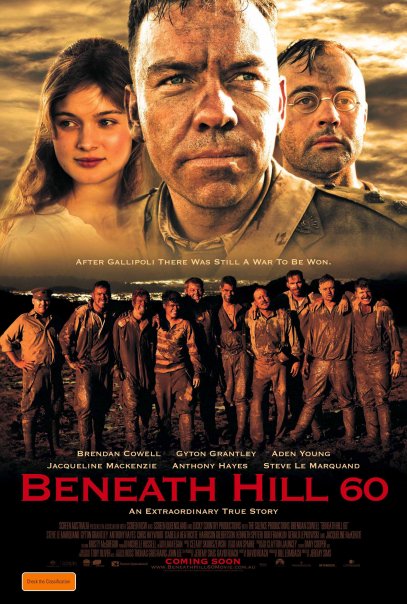
9. Beneath Hill 60
8. The Last Song


7. Sex and the City 2
6. The Expendables (read more)
5. Secretariat


4. Savages Crossing
3. I Love You Phillip Morris (read more)


1. The King's Speech (read more)

How about that? Do you agree? Disagree? The top 50 - ie; the good stuff! - coming very soon!
4 comments:
I'm not sure if I agree with your order!!!
There are a few posters at the top of the list that aren't as bad as the ones behind them!
Creation's poster isn't even that bad! (Yes, I know you have a problem with floating heads! But maybe they're not floating! Just resting!)
The Creation poster is so high because it is the safest poster I could possibly imagine. I really wanted to put Conviction on there for the same reason, but Creation had floating heads in the sky so it won out.
How Do You Know *has* to be the worst. As laughable as the clearly photo-shopped King's Speech is (and why is Helena's face melting?), I would honestly prefer some sort of attempt to no attempt at all. "Uh...actors. In boxes. Colors. Go with it."
There are only two here that I disagree with (or at the very least, don't understand your rational, Glenn; but then, I always enjoy your write-ups) is "Day for Knight" and "Secretariat". Day for Knight's assymmetrical retro color splashes, don't show the stars faces 'cause the names are enough graphics are a ba-zillion times better than any posters I'd seen here in the US (or on the internet) thus far; it actually caught my eye. I can imagine myself passing a theater, seeing that, and wanting to know more. (Now the US poster - that was a disgrace, for the love of God.)
And I liked the simplicity of Secretariat's image - in the US, I think the poster went more sentimental/golden-glowy in a saccharine way. This is clean, zippy, grabs my eye and is a visual relief from so much clutter (including most of the other posters here.)
A lot of the others, I'm not sure if several of them are "bad" so much as plain damn boring. Which ought to be a crime in an industry peopled by "creative types".
Post a Comment