
I've decided to expand this year's look at 2010's year of movie posters. I was doing my list and it just get growing and growing. What can I say? I love a good poster! Some of you may have already had a peek at my favourites (and least favourites) of the year by reading my article at Trespass, but that list is tiny compared to this one! Plus, it only went by Australian release dates (hence Precious, but no Black Swan, for instance). The below "awards" and subsequent list (in part two, tomorrow) of the year's best and worst posters is comprised of a wholly unspecific list of American release dates, Australian release dates, festival titles (those without release dates tend to chart, those that do can wait for their moment at the end of 2011) and whatever I came across in my travels. I hope you enjoy and feel free to chime in with your favourites, disagreements and outrage.
Tomorrow will be the list, but until then enjoy these fun "awards" that I give away every year.

The Expendables

The really terrible Photoshop hack-job that happened on the posters for The Expendables were strangely - although, ultimately, not surprisingly - ignored in favour of people spending more time talking about women they apparently hate in a movie they know they hate before seeing (that'd be Sex and the City 2), but nothing made me escape the horror fright show that is Mickey Rourke's face on this poster. Or Bruce Willis' face. Or Sylvester Stallone's face. Or Randy Cou... okay, all of them, really. More on this poster.
Sex and the City 2


No, it doesn't get off lightly. We all know why these are bad, but it's sometimes easy to forgive and be all "well, they can't show Sarah Jessica Parker's cellulite, can they?!?" But then I figure "well, they'd probably get more - and better - press if they did!" And really, the less said about Kim Catrall's face here the better.
Unnecessary "Series"
The Legends of the Guardians: The Owls of Ga'Hoole, Repo Men, Never Let Me Go,
Shanghai, TRON: Legacy, Agora


Really. Could anybody tell the difference between any of the owls from The Legends of the Guardian? And yet they all got their own individual poster! I didn't need to see all those posters for Repo Men or Shanghai, nor did TRON: Legacy need 30 designs for the same thing. Strangest of all was Never Let Me Go, which is hardly the sort of film you would think warrants character posters for its protagonists, and yet somehow we got them. Meanwhile, the only people who will get anything out of individual character posters for Agora are people who get off on history in a big way.
Triangle
Creation

I actually did a little jump out of my seat when I first saw this design. They really are big giant floating heads, aren't they!
The Bounty Hunter

Because nothing says "fun night at the movies with my gal pals" than a woman being sat on by a big oaf. Amirightladies?
Let Me In
From
 to
to 
cheapened Hollywood multiplex poster that takes the same basic concept that made that first poster so good and drains it (pun intended) of every ounce of its life-force. Take a look at this travesty. More on these posters.
The Last Exorcism

No. I think it's the gross open legs.
Case 39

Because nothing says "see my movie about Renee Zellweger opening a mysterious 'case'" than Renee Zellweger reaching into the pantry for some peanut butter. What? That's not what she's doing? Oh, well, maybe they could have, oh I dunno, made something - anything - clearer? Yeah, maybe.
Beneath Hill 60

This is not a movie about rugby. Apparently the poster thinks it is.
Never Let Me Go

Marketing you movie to people who enjoy movies about people running down piers, that'll turn your arty, British sci-fi movie into a hit, won't it!
All of them! - no, but seriously
My Soul to Take

I actually really like this design for Wes Craven's horror flop, especially in a year where horror films generally didn't have all that much going for them. That big blurb at the top, however, is clunky and unnecessary. In 3D!
Cats & Dogs: The Revenge of Kitty Galore

I remember standing outside the Greater Union cinema on Russell Street as I waited in the line for The Radiant Child at MIFF when I saw this poster for the first time. I let out a mighty guffaw at the time, which was a bit embarrassing since I was by myself and people stared at me. They then took a gander at the poster I was looking at and promptly joined in. Really. The juxtaposition between it and the movie we were waiting to see the film festival was too powerful.
I anticipate the poster from 2011 that takes out this "prize" will also feature a dog after this and last year's Heavy Petting have taken it out in successive years.
Secretariat

Trust me, there were so many contenders here - how about Clash of the Titan' "Titans Will Clash", The Tooth Fairy's "The Tooth Hurts" or I Spin On Your Grave's "It's Date Night" - but the worst of all was this treacly poster for horse racing drama Secretariat. It all but screams "Oh Oscar, you're such a big, strong, sexy man, please make love to me ooooh!" but to throw that ridiculous tagline is unforgivable. It's "impossible" is it? I hate you! Maybe if it was impossible the movie wouldn't exist and we'd all be better for it.
The Town


These posters for Ben Affleck's crime drama The Town aren't necessarily "bad", but they certainly are disappointing and uninspiring. If you're going to utilise the imagery of rank robbers wearing nun outfits and carrying guns, why not have more fun with it? Line them up like The Usual Suspects or something! I'd also suggest the marketing team behind The Fighter could have done something better for the film, but the work there gets the job done.
Jack Goes Boating

Does anyone called Jack even go boating in this movie? The poster certainly seems to think there is and that he does. You couldn't exactly look at this and figure "maybe the title is a metaphor?" I mean, it looks pretty clear that Jack does indeed go boating. What's the deal?
Inception, Dear John,
The Art of the Steal, The Company Men


I was just going to call this category "Worst Rip-Off", but they're not exactly bad posters, just obviously derivative of other (better) posters. In case you're wondering what posters they're meant to remind you of, they are: Peter Pan, Any other Nicolas Spark movie, Small Time Crooks and Glengarry Glen Ross. There were dozens of others, but these felt the most obvious.
The Alamo Drafthouse's "Rolling Roadshow" Posters


Oh sure, they're not posters for new movies, but the Saul Bass impersonations were low in 2010 and anything to not have to give this prize to Buried by default. Jesus, I really don't like that Buried poster. You know the one I'm talking about, right? Of course you do, I'm not even going to link it I dislike it so much.
Uncle Boonmee Who Can Recall His Past Lives

This poster has a sort of soothing quality to it, don't you it? Those beautiful, almost sparking colours of the waterfall that resemble blue, silver and purple, the deep green of the vines and that beguiling mix of red, pink and orange found in the dress. It's the only poster for Apichatpong Weerasethakul's film that I feel represents what I've read about the film with its mystical qualities. This is a Spanish poster and is the first to go outside of the hairy beast man imagery as its focus.
{tie}
Certified Copy and Catfish

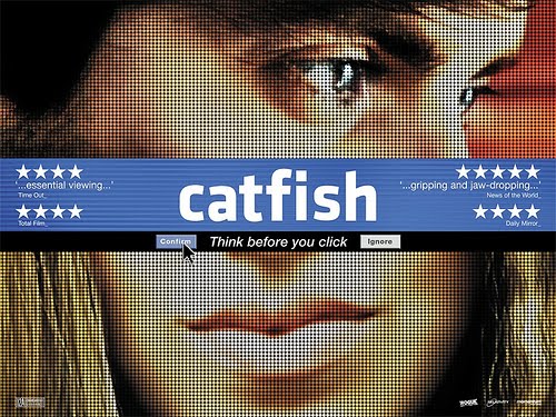
I love that the British quad - a form of the medium that can sometimes bring about better results, truthfully - uses such big and bold colours for Certified Copy. And while the quad for Catfish plays with the film's themes a bit more obviously, I think it makes for a better and more visually pleasing poster and it plays a bit more mysteriously.
Grown Ups
From
 to
to 
The first poster is obvious, lazy, technically flawed and just flat out annoying. The series that followed, featuring teenage photos of the film's male castmembers - actually has a charm and a bit of humour about them.
Daybreakers

Works from an idea from the posters for TV series True Blood (with a little bit of Saw's "blood drive" campaign thrown in), but it's still a nifty idea and it looks impeccable.
Daddy Longlegs (aka Go Get Some Rosemary)

This category was born out of the idea that these absolutely tiny independent films sometimes come up with the best posters because they have such limited resources and must come up with something truly eye-catching and memorable. Something about this painterly design for Daddy Longlegs really appeals to me. I look at it, tilt my head slightly sideways and wonder what it means (perhaps it doesn't help that I haven't seen the movie?) To paraphrase that old art saying, "I don't know what it means, but I like it!"
Black Swan


What can I say that hasn't already been said about these enthralling designs for Black Swan? Looking simultaneously like trashy novels, classy noir cinema and bold artistry to be hung in a gallery, they are truly captivating and so perfectly suit the movie they're selling. Meanwhile, Scott Pilgrim vs The World proved that some movies actually warrant the "character series" treatment. Appropriate and very cleanly done, I like!
The Social Network

YOU DON'T
GET TO
500 MILLION
FRIENDS
WITHOUT MAKING
A FEW
ENEMIES
Yes, it's brilliant. I was originally going to go with The Four-Faced Liar, but it's tagline - "A comedy about drama" - is actually taken word-for-work from Camp, so I deemed it ineligible. I love being able to make up rules on a whim, don't you?
(in alphabetical order)
Cold Weather, happythankyoumoreplease, A Horrible Way to Die,
Jane Eyre, Les amours imaginaires, Prom

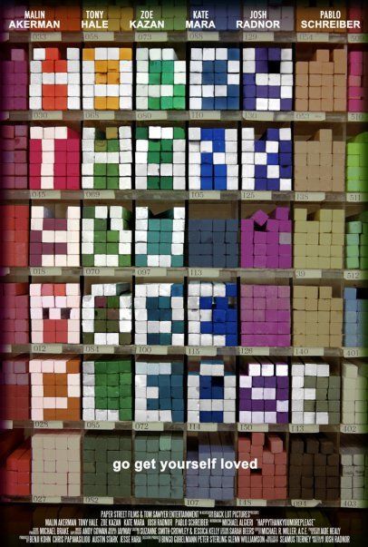


We're always on the lookout for great posters and we've already spotted these designs that will surely hang around the right level of incredible to be included on 2011's list. I'm particularly fond of Jane Eyre (previously discussed) and happythankyoumoreplease, which - like I was saying about the "best use of indie money" category - does a great job of grabbing the eye with such few resources. Great colours and a bit of imagination will get you far in my book!
Yogi Bear

Whoever let that copy slip by them needs to be fired, but sent home with a (pic-a-nic) basket of fabulous goodies for providing us with such entertainment in 2010. [insert smutty joke - i'm sure yours are better!]
And with that we reach the end of part one. Tomorrow we'll countdown the 25 worst posters of 2010 as well as the top 50! It'll be a blast, see you then!
5 comments:
A great read, Glenn :)
I still remember the first time I saw a Social Network poster (in real life) and couldn't stop the amazement and joy I got from the tagline. BRILLIANCE.
I know what you mean by the Never Let Me Go poster, but I just think it's so so beautiful :)
The Town posters are so disappointing... Looks like something I could put together for a dodgy fan fiction.
I'll be interested to see your lists tomorrow.
Glenn, did you see the recent winnie the pooh poster?
http://www.impawards.com/2011/winnie_the_pooh.html
One of my most anticipated for 2011
I'll expect to see The Rebound poster on list tomorrow. My worst poster of the year.
Yogi has provided me with endless entertainment. I mean, they had to be doing it on purpose.
Love. The. Quad.
I stagger to think how much time went in to uploading all this, Glenn. Thank you!!
We saw a big standee thing of the Expendables poster in the movie theater and the thing I noticed was that they adjusted everybody's heights so that they all appeared to be about the same height (when in reality their heights are wildly divergent), but that they kept Jet Li small.
Post a Comment