Wednesday, February 29, 2012

Review: Like Crazy

Like Crazy
Dir. Drake Doremus
Country: USA
Aus Rating: M15+
Running Time: 86mins

I have a more appropriate title for Drake Doremus’ twentysomething romance fable, Like Crazy. It’s hardly beyond reason to think that a film with such a title should be a bit more wild and bold in its ambitions and executions. Shall we say it should be more… crazy? Rather than anything close to resembling the state of a mad, insanely heretic love that can conquer all, the lovebirds at the centre of this frustrating film would be more apt to call their love affair “like pleasant”. Perhaps “like cute” in a pinch. If this is the filmmakers’ idea of crazy then they must implode of excitement at their local Bingo Night.

Read the rest at Trespass Magazine

We went for something a bit different in reviewing Like Crazy over at Trespass, with two of us - one on the positive, one negative - reviewing it side-by-side. I, however, think I win since I even have the ladies at Go Fug Yourself agreeing with me, y'all! The Power of Fug is on Team Glenn. C-

Tuesday, February 21, 2012

10 Great Moments from Steven Soderbergh's Schizopolis

Wow.

I had never seen Steven Soderbergh's Schizopolis, a film that some people have murmured about being really spectacular, but which most either hate or haven't seen. In 1997 it made just a smidgen over $10,000 and it was widely panned at the Cannes Film Festival, so when I happened upon it at my local library I grabbed it. The Criterion DVD cover states it is "inspired by rumors, bald-faced lies, and half-remembered dreams!" That certainly sounds about right, but it's bizarre experiment into surrealism is so wildly inventive and entertaining that I find it quite easy to rank this alongside Erin Brockovich and sex, lies, and videotape as Soderbergh's finest work. Appearing as if like an oasis, Schizopolis feels miraculously ahead of its time and says more about the modern man's existence than many straight-forward dramas. It's unique brand of comedy, filled with non-sequitur sidebars, roundabout running gags and over-lapping, non-linear plot strands that double back on themselves to reveal altogether new and twisted meanings, feels like a precursor to the brand of humour made popular out of television series such as Arrested Development, Scrubs and Community.

So, as a way of not taking up 2000 words describing why it's so great, I thought I'd do a list. In chronological order, here are my ten favourite bits about Schizopolis. I could make a list of so many, many more but I have to draw the line somewhere. I hope that if any of these things tickle your fancy in the written form then you should run to a copy of the DVD - the Criterion edition, which is the only one out there as far as I am aware, has extra gags on the insert of the DVD sleeve and apparently a truly bonkers Soderbergh interviewing Soderbergh audio commentary that I unfortunately ran out of time to listen to - and see it for themselves. It's all so magically insane and the actors are incredible and give the dialogue a free-flowing quality that acts as a natural grounding to the absurd proceedings.

1. The Introduction
The film's writer, director, producer, cinematographer and, yes, star, Steven Soderbergh, introduces his film to audiences in a prologue that was included after the film's negative reaction at Cannes. Never one to kowtow to distributor pressure, Soderbergh then made the prologue as kooky as the rest of the film as the camera frequently spins out of orbit in between Soderbergh extolling such boastful dialogue as "this is the most important motion picture you will ever attend ... the delicate fabric that holds all of us together will be ripped apart unless every man, woman and child in this country sees this film and pays full ticket price, not some bargain, cut-rate matinee deal."

"In the event that you find certain sequences or ideas confusing, please bare in mind that this is your fault, not ours. You will need to see the picture again and again and again until you understand everything."


2. The mole, the spy and the right-hand man
This entire scene appears to be little more than a reason for Soderbergh to assemble some of his wonderfully off-beat cast (including Eddie Jemison who is one those "that guy!"s that routinely pops up in everything under the sun) to stand around reeling off delightfully convoluted dialogue that is constantly being repeated, corrected and upended. This entire scene had me chuckling from beginning to end the sheer simplistic lunacy of it all.

"This guy tells me the right-hand man has a mole."
"A spy and a mole?"
"No, I didn't say that, I said - "
"You said there's a guy leaking information... that's a spy."
"Then you said the right-hand man got himself a mole. I would assume to check on the spy."
"That's two people."
"Okay, there's a spy and a mole."
"Well that's twice as many as a minute ago."
"I say the guy who told you is the mole."
"You're the mole."
"No, no, no, no, he's the spy."
"No he's the spy!"
"If I were the spy would I be standing here saying there a spy?"
"Or a mole."


3. "Generic greeting"
Perhaps my favourite scene in Soderbergh's entire bonkers affair are the stretches of dialogue in "segment 1" wherein Soderbergh's Fletcher Munson and his wife exchange empty words with fake inflections and exaggerated facial expressions. Deliciously inspired, it's probably one of the keenest observations on a failing marriage I've seen in quite some time.

"Generic greeting."
"Generic greeting returned."
"Imminent sustenance."
"Overly dramatic statement regarding upcoming meal."
"Oooh, false reaction indicating hunger and excitement!"


4. sex, lies, and videotape
The sly references to his Oscar-nominated, Palme d'Or-winning classic, sex, lies, and videotape, appear throughout as a peculiar exterminator man who enters peoples houses and has sex with the stay-at-home wives them while filming and taking photos on their person cameras. Why not, I guess?


5. "Proofing!"

6. The news reports
As far as I can these these little inserts have literally nothing to do with the rest of the film, which is why their randomness is so amusing. Perhaps another example of Soderbergh's sign of Soderbergh's sign o' the times ideology as we criticises the laziness of films to simply have a news reporter reel off a bunch of exposition before moving on to yet another scene of bare-brained action. "At least we didn't sell it to the fucking Japanese", was another priceless one from later in the movie.

"We interrupt this program to bring you a news bulletin. Scientists at NASA have confirmed that the comet Havarti is on course for Earth. The odds of the comet colliding directly with our planet are being calculated at this very moment. In a related story, the price of capturing, restraining and institutionalising a naked man in a tee-shirt remains stable at around $367.50."


7. Muzak
For whatever reason, I just love that the second of Steven Soderbergh's self-acted characters listens to mall muzak in his car. Didn't Arrested Development use muzak, or just had music inspired by it? I seem to recall that being a thing. Gosh, I need to rewatch Arrested Development! So very good. Is that movie ever happening? If it does I hope it's as polarising as, say, Twin Peaks: Fire Walk With Me was.


8. Golf
Don't even bother trying to get me to explain this.

"And then another funny thing happened followed by two things that were pretty amusing and the whole thing ended with something that was just hysterical."


9. Foreign languages
In a twist on the "generic greeting" sequences from earlier, the first third of the film is now replayed through the eyes of Soderbergh's wife (literally, she's played by Soderbergh's ex-wife) with all of his dialogue spoken in Japanese, French and Italian. Just go with it, okay?


10. Q&A
Soderbergh returns to the empty theatre of his film's prologue and indulges in a one-way question and answer session. What with there being nobody to actually answer questions (surely he knew nobody was going to go see this film and so, in effect, has the last laugh) he merely replies with nondescript answers that could apply to all sorts of questions on any number of topics. Schizopolis features no opening or closing credits so these prologues and epilogues act as book-ends to an otherwise rather shapeless entity.

"I know this is an unusual procedure, but I thought you might have some questions and since I'm already here I can answer some of them. Yes. Yes. Not specifically, I actually find all of them rather weird. Yes. Foot-long vegie on wheat."

Like I said, it's kind of hard to really boil everything from Schizopolis down into an easily digestible read. I hope anybody out there who hasn't had the pleasure of discovering this obscure gem does so (I know there are a lot who haven't, okay!) because it truly is a one-of-a-kind experience worth indulging. Even if you end up disliking it, you won't be able to say it wasn't something you'd seen before. A

Saturday, February 18, 2012

Review: Buck

Buck
Dir. Cindy Meehl
Country: USA
Aus Rating: PG
Running Time: 88mins

“I’m not helping people with horse problems, I’m helping horses with people problems.” So declares Buck Brannaman in Buck, an affectionate documentary look at a man whose midwestern fusion of animal hero and Americana legend endears him to horse lovers around the globe and inspired novelists and filmmakers who coined him “The Horse Whisperer”. If Steven Spielberg’s War Horse got on your nerves as much as it did mine, then consider Buck the alternative. Simple and pristinely told with nary a manipulative music score or peach-stained sky to wring tears from even the most unflappable of equine fans, this is a charming – if occasionally too thin – look at Buck’s fascinating life.

Read the rest at Trespass Magazine

Friday, February 10, 2012

Polka Dots & Sunglasses: The Costume Design of Les Diabolique

With so many voices out there on the internet - the last thing we need is another one writing the same ol' retrospective review of the same ol' film that everyone already knows is a classic - I thought it might be interesting to begin looking at specific elements of some of the films I watch, both old and new. I hope it inspires me to write more about some of the great films I see, and inspires you dear readers to try and admire the unexpected.

This entry contains spoilers, granted for a film from 1955, but I successfully avoided any so maybe you should too if you've never seen Les Diaboliques! I can't recall any other films that actively end with text telling the viewer to be silent about what they just saw, that's how blind you should go into this film.

"Vintage". It's a word that gets thrown about a lot today in relation to fashion. Whether it actually is vintage, or just has the same musky, old-timey appeal of something that is, it's become an adjective to describe items of clothes that one would associate with another time and place. Henri-Georges Clouzot's 1955 noir horror, Les Diaboliques, isn't a period film at all - or, at least, I don't think it was at the time - but I couldn't help but think of this phrase, "vintage", whilst ogling the delicious costumes that appear throughout. Despite featuring no credited costume designer, the duds of Les Diabolique are a masterclass of (at the time) contemporary costume design, as outfits of various shapes, colours and designs help inform the characters that wear them. It was just one of many beautiful aspects to this French classic that impressed me upon watching Clouzot's film for the first time last evening.

A black and white checkered dress - with fan - worn by Véra Clouzot in Les Diabolique

The first costume I couldn't take my eyes off was the gorgeous checkered dress that Véra Clouzot wears, shown above. Almost like houndstooth in pattern, it's a stunning sundress that I can easily see being worn today with, perhaps, just a little less formal structure.The fan may be a bit much, but this outfit is just the beginning a trend for the meek Mme Delassalle whose wardrobe consists entirely of outfits that pair black with white. Utilising the good ol' concept of white representing good and pureness, whereas black represents evil and "the devil" (the translation of the title, Les Diaboliques), the costuming of Ms Clouzot is clearly a way of symbolising her character's dangerous dalliance between the two. Later on in the film she wears loose-fitting white shirt with deep v-neck and a long black dress, and then later a white dress shirt and skirt with black shall. Always conservative - Mme Delassalle is a school teacher after all - with her hair braided and tied at the back, she never full embraces the colour of white for her entire outfit until the climactic scenes in the school hallways once she has confessed to her crimes. It's a simple motif, and occasionally very literal - hello Star Wars - but given the very moral discussion of right and wrong, it's a motif that works.


A black and white polka dot dressing gown that even I want!

My favourite costume worn by Véra Clouzot is the black and white polka dot dressing gown warn at several occasions throughout the movie (I do love when a character rewears clothes, it gives a film such a sense of authenticity). Seen up above this paragraph, it's a simple piece of costume that is not only gorgeous to look at, but character defining as well. It's unassuming nature - no glimpse of sex appeal there - perfectly encapsulates the mademoiselle's attitude as a somewhat repressed woman who isn't interested in dressing for anybody other than herself. I admit that even I want a black and white polka dot dressing gown now, preferally one made of material that looks as smoothly elegant as the one shown here. The gloss and the reflection of light make me suspect it's made of a very luxurious fabric and, good grief, wouldn't we all want that on us morning and night?

Simone Signoret, as Clouzot's partner in crime, also gets the black = evil, white = good treatment, except she doesn't come out looking quite so rosy (er, mixing up my colour metaphors there, aren't I?) Pictured here to the left, she is always seen wearing outfits of black, charcoal and dark grey. Yes, I do realise I am discussing colours that are obviously in the spectrum of "black and white" and that the cinematography couldn't determine whether she's wearing crimson or purple or black or gold, but it's obvious to tell she has been deliberately given darker hues to Clouzet's Mme Delassalle because she is ultimately the far guiltier party of the two. Usually dressed in long body-hugging dresses that provide a sex appeal that her friend never does, Signoret's Nicole Horner is frequently the more mysterious of the two and given far less opportunities to show remorse through her costumes. She's a vixen and proud of it. I simply adore the sunglasses she wears in the early scenes at the school that make for effortless cool alongside her near bleach blond hair and dangling cigarette. It's a look I've seen replicated many times in recent years, although one has to suspect that those recreating this look - regular everyday women and celebrities alike - know what era they're basing their looks on.

"So Frenchy, so chic!" goes the saying - although does anybody make reference these days to a "Prince of Wales suit"? I doubt that - and Les Diaboloque proves that. Of the film that they inhabit? Divine. A tingly fright factory that garners scares out of our own imaginations, it's final scenes made my entire body freeze. Without a single peep of a musical score to telegraph the audience's fears and emotions (apart from the opening credits, that is - did Phantom of the Opera ruin organ music for everyone?) it obviously works best if you don't know the twists to come (so I hope you paid heed to that spoiler warning up top if you intended to watch it), but it's such a finely crafted piece of work that repeat viewings would hold such a delicious richness to them. Something the patently ridiculous-looking remake surely can't achieve. Unless Kathy Bates punching someone in the face is your idea of fine craftmanship... actually, maybe it is worth a look after all.

Monday, February 6, 2012

Review: Shame

Shame
Dir. Steve McQueen
Country: UK
Aus Rating: R18+
Running Time: 101mins

Look, let’s just get this out of the way from the get go: Yes, the first five minutes of Shame are all about giving audiences the bug eyes as Michael Fassbender strolls around his apartment completely starkers. All the nudity may have given Shame notoriety and more attention than Steve McQueen’s sophomore film may have otherwise received, but it’s far from its only virtue.

Read the rest at Trespass Magazine


Yes, I wrote that Shame is "too horny for its own good", what's it to ya? Still a good movie though!

Monday, January 30, 2012

Review: The Artist

The Artist
Dir. Michel Hazanavicius
Country: France
Aus Rating: PG
Running Time: 100mins

It can be tricky watching a film like The Artist at this point in the game. Riding high on buzz from last year’s Cannes Film Festival, this charming French film from director Michel Hazanavicius (creator of the OSS 177 series) has a lot to live up to. Having steamrolled through award show season, and placing as the odds on favourite to win Best Picture at this month’s Academy Awards, Australian audiences finally get to see what all the fuss is about of this black and white, silent film. Don’t you worry, there’s reason to fuss.

Read the rest at Trespass Magazine

Review: Martha Marcy May Marlene

Martha Marcy May Marlene
Dir. Sean Durkin
Country: USA
Aus Rating: MA15+
Running Time: 102mins

“Do you ever have that feeling where you don’t know if something’s a dream or a memory”, asks Elizabeth Olsen’s deeply traumatised Martha. It’s a line that perhaps best encapsulates Sean Durkin’s fascinating debut feature about a girl who escapes a commune and spirals under the eye of a disillusioned sister. Durkin has crafted his film with such a magical, mysterious sense of fluidity where images blur into one and memories of the past merge effortlessly into the present. It is a towering achievement of construction and simmering tension that sees this heretofore unknown Olsen sister navigating a trajectory that is both tragic and deeply wounding. If We Need to Talk About Kevin was an arthouse take on the "demon seed" subgenre of horror, then Martha Marcy May Marlene takes a similar metaphysical path to a slasher flick as this one girl is slowly, but surely, chased down. Not by a physical being per se, but by the psychological scars of a hurtful society. They're coming for her, and she has nowhere to go but to hide for as long as possible until the inevitable comes.

The situation that Martha finds herself in is not entirely explained, nor delved into with any great details, she merely finds herself in the company of a commune. This cult-like place is watched over with unsuspecting menace by Patrick, played by a growling John Hawkes. The brief glimpses of this near self-serving community are initially quite placid, but much like Martha’s re-integration into society, things go wrong very quickly. The film opens with Martha making a seemingly half-hearted attempt to escape through the woods of the New York Catskills early one morning. That she is found later on but her commune brother in a nearby town is not the scary part; the scary part is that they let her go.

Sumptuously filmed by cinematographer Jody Lee Lipes, Martha Marcy May Marlene – the “Marcy May” and “Marlene” refer to alternate personalities that Martha adopts at various intervals – appears to be filmed through a swatch of delicate lace, as delicate as the central character even. The deep greens and blacks don’t look quite as natural and rich, but are leant an almost dreamlike quality as if seen through sleepy half-closed eyes. Continuously filmed with obstructed lines of sight, it has a visual verve that belies its origins. I am always impressed by lower budgeted films like this that are able to craft such specific tones, and along with the impressive sound work – Martha sits alongside recent titles The Turin Horse, Antichrist and Meek's Cutoff as films that have made nature sound so eerily foreboding in the cinema – Durkin has allowed the locations of his film to help shape the story rather than merely accentuate it.


The ambiguity of the ending will surely leave audiences questioning what they have or have not seen, with its quiet demeanour will ultimately prove too impenetrable for some. I, on the other hand, found its relaxed-like-molasses atmosphere to be the perfect compliment to the powerful story. The encroaching horror weaselled its way into Martha's mind as well as mine, and several scenes towards the end – in particular a disastrously unnerving dinner party sequence that should have netted Olsen an Academy Award nomination – ratchet the tension up to levels that feel inconceivable at the outset. Like the guitar that Hawkes’ magical leader strums in front of an adoring crowd, Durkin works his film’s elements masterfully, timing everything perfectly so as to create maximum impact for even the slightest of incidents. Martha Marcy May Marlene isn’t a film I shall forget too quickly, it’s hushed terrors nagging like an itch under the skin. Its final haunting passages of deeply rooted paranoia are unforgettable. A

Thursday, January 26, 2012

Review: J. Edgar

J. Edgar
Dir. Clint Eastwood
Country: USA
Aus Rating: M15+
Running Time: 137mins

Hounded at every turn by a smothering mother, unable to freely express his love for a male co-worker in a conservative political landscape, disrespected by colleagues, and prone to bouts of cowardice at moments that called for heroics; it’s easy to assume that J Edgar Hoover lived a very sad life. None of that compares, however, to how drearily sad the film of his life, J. Edgar, is. Clint Eastwood directs his expansive tale with a wash of drab colours – the brown colour palate of Tomas Alfredson’s Tinker Tailor Soldier Spy looks positively lively compared to the metallic near monochrome colour scheme of Eastwood and cinematographer Tom Stern – and a never-ending heavy-handedness. It’s Eastwood’s second film in a year that has been suffocated at the hands of grand ambitions that failed to materialise when a more intimate approach probably would have worked better.

Coming hot on the heals of the improbable box office success of Phyllida Lloyd’s The Iron Lady, J. Edgar takes a near identical flashback heavy approach to the life of Hoover, rather lazily played here by Leonardo DiCaprio, as an older, frail man looks back over his life. While it thankfully doesn’t use that terrible Margaret Thatcher biopic’s absurd ghost motif to get from one Wikipedia entry heading to the next, it does haphazardly jump around through time and space as if at whim with little thought as to how one memory leads to another. Why do the people in these sorts of films always have such perfectly linear, chronological memory?


As if the dour cinematography, lit seemingly only by low watt lamps and natural light filtered through grey skies, Eastwood’s twinkly jingle jangle score would certainly put a sour mood over the proceedings. Perhaps he is to be commended for eschewing the traditional overwrought John Williams type of music, but those same incessant piano keys getting stroked over and over again like some villainous cat is nigh on nauseating.

Of course, as tends to happen with films of this type, really interesting stuff is either glossed over or chucked out altogether. The screenplay by Dustin Lance Black (re-using his Milk structure to diminishing returns) appears to be trying to have it both ways, dotting the script with big grand moments of historical significance alongside small scenes between Edgar and his mother, played by Judi Dench on Autopilot, and his alleged lover and Associate FBI director, a wide-eyed Armie Hammer as Clyde Tolson. Rarely complimenting each other in any way, I couldn’t help but suspect there was more interesting stuff to be said, especially since the private sequences are quite clearly just pulled out of thin air. Where was the public’s reaction to his private life? Where was the motivation behind the loyalty of Naomi Watts’ Helen Gandy? The list could go on and on. Meanwhile, a sequence addresses rumours of a fondness for cross-dressing is doesn’t feel like an organic part of the story at all, just merely tacked on for effect.


Too long, for sure, Eastwood and his editors, Joel Cox and Gary Roach, could have made the near two and a half hour length much less unwieldy by cutting out the unnecessarily repetitive scenes of Hoover recounting his memoirs to an eager fellow FBI agent (who puts new meaning to the term “paper pusher”). As DiCaprio’s heavily made-up elderly Hoover extols blank cheque platitudes about democracy, freedom and the fine line between right and wrong, it’s hard not to find the eyes rolling (or, even worse, drooping). Featuring some downright frightening make-up work on Armie Hammer – looking like some scary pod person from whence an alien entity is soon to burst free – and some truly ridiculous political impersonation – Christopher Shyer as Richard Nixon is just off the chart bad – gives J. Edgar an at times comical edge. Although I probably would have preferred some good ol’ fashioned hoots, Eastwood’s film is too much of a sad sack to let us even have that. The life of what the posters tell us is “the most powerful man in the world” has been filtered through so many sieves that it’s rendered dull. D-

Monday, January 23, 2012

Review: Weekend

Weekend
Dir. Andrew Haigh
Country: UK
Aus Rating: MA15+
Running Time: 97mins

The mechanics of a one-night stand are explored in Weekend, the engaging sophomore feature of Andrew Haigh. Where this low budget British feature differs from the majority of films with similar premises is that both parties involved are men. However, to simply call it “a gay movie” would commit it a great disservice as the fragmented kaleidoscope of fleeting romantic pains and pleasures should resonate with gay and straight audiences in equal measure. Haigh and his lead actors, the superb Tom Cullen and Chris New, have created a richly textured navigation of modern day romance that never fails to pull powerful, human emotions out of its minimal, boutique setup.

Read the rest at Trespass Mag

A film that only grows in memory as time goes by, I really do hope Weekend finds some ounce of success at the Australian box office. Doubtful, but I hope so. The success of the film was only strengthened by a recent watch of Thomas Bezucha's Big Eden. Released in 2000, this film was naturally acclaimed by gay audiences, but I couldn't help but find the film a somewhat bizarre and deflating sit. I was initially impressed by the mere fact that it looked like it was filmed using a real cinematographer with an actual camera that cost money - what a novel idea - and that the music wasn't bouncy, pseudo porn soundtrack music, but real music that sounded like it was recorded in a studio with instruments. As nice as it was to see a gay romance storyline play out between actors like Arye Gross and Eric Schweig, hardly the typical romantic leads you'll find in gay or straight cinema, the film gives way to unrealistic and cliched plotting that becomes increasingly tiresome. There are characters here that could have been taken in some really interesting directions, but Bezucha, who also wrote the screenplay, lays the sweetness and light on thick with a trowel. As gorgeous as the scenery is, the action going on around it is rather colourless. The ending of Weekend could easily been a horribly cliched affair, but it's played so modestly and with utter realism that they get away with it. Yet, in Big Eden, it's hard not to chuckle when a characters makes the mad dash to the airport to stop the other one leaving. The floorboards creak as it lumbers about its familiar plot developments, whereas Weekend dances and weaves, using our familiarity with the genre tropes as a base to explore the inner turmoils of these characters. They were clearly going for something less artificial than, for example, Eating Out or Another Gay Movie, so why stifle that with cliche and quirk?

Also, while it's not like I think every film with gay characters set in Smalltown, USA should be Boys Don't Cry, I did feel that it was somewhat insensitive in it's naivety to make the town of Big Eden so comfortable with its lead's sexuality. Not one moment of conflict arises out of the situation and as lovely as it would be to live in a world where that is the case, it's just not the case and I found the film's reluctance to even broach the subject somewhat confounding. Big Eden coasts on little more than the belief that audiences - especially an audience made up predominantly of gay men - will want little more from a film than to see two men fall for each other and live happily ever after. Consider Weekend again and think about how much, even if you disliked them, we got to learn about these two men. They had real histories with problems both large and small, their personalities are so clearly defined that their growing romance appears more natural and realistic. There is so little of that in Big Eden as everyone acts like movie characters dealing only with big, cinematic dramas that can be written as easily and broadly as possible (dying dads! coming out! etc!)

Of course, I did enjoy seeing Tim DeKay without a shirt on though and we all know that's one of the most important factors in judging a piece of gay cinema, right?

Photobucket Photobucket

Right!

It's just a shame his character, by far the most interesting and complex of the lot, was shafted for Schweig whose idea of playing a shy character is to make them as boring and transparent as possible. Ah well. Weekend: A-, but a rewatch will probably shuck away any niggles I had and I'll have to bump it up. Big Eden: C

Tuesday, January 10, 2012

Review: The Descendants

The Descendants
Dir. Alexander Payne
Year: 2011
Aus Rating: M15+
Running Time: 115mins

I don’t think co-writer/director Alexander Payne always had disdain for women. Citizen Ruth and Election didn’t exactly have lovable women at their core, but they were well-rounded, flawed, complex women who were doing what they felt they had to do to survive. In those intervening years – he also directed About Schmidt and won an Oscar for Sideways – something must have happened (perhaps his divorce?) because The Descendants is an exercise in why women are such horrible, despicable shrews. When this film isn’t demonising its female characters for daring to be unhappy in their marriage, it’s condescending them for showing too much emotion and even berating them for drinking alcohol. By the time the film’s conclusion rolls about and the rightful masculine presence has been reinstated on this broken family, The Descendants has long – ahem – descended into an irredeemably dire affair.

Read the rest at Trespass Magazine

So, basically, I didn't like it. I'm truly flabbergasted that it has trailed such a blaze throughout the US awards season. Or, actually, maybe I'm not all that flabbergasted because The Descendants fits very comfortably into that safe territory of American "indies" that people seem to wet themselves over. It's easily comparable to titles like Little Miss Sunshine and Juno in the way it juggles drama and comedy and can make people feel all warm and cuddly by knowing they're supporting "arthouse cinema", but unlike those films it's actually really, really bad. I didn't have enough words to really discuss some of the other troubling aspects of the film - the weak as piss character development that sees Shailene Woodley's daughter character have a cry in the pool and instantly become daddy's BFF, or the weird way Clooney's character takes his 10-year-old daughter away from her mother who has had her life support turned off and is about to die! - but I think I was able to demonstrate my major qualms with Payne's film.

As for the awards? Well, I don't think it has any right being in the discussion for best picture, director (what whitewashed direction Payne provides!) and screenplay. Clooney is Clooney and while his narration is toxic, he does at least try to enliven the proceedings with a roster of "wacky" faces. Shailene Woodley, looking like a definite possibility for Best Supporting Actress is... well, I can see why because she's quite good and is actually able to forge through with some peaks and valleys, but as the eloquent Nick Davis recently opined - where, I unfortunately cannot remember - if Academy voters cannot find five better, further reaching supporting female performances from 2011 then they simply are not looking hard enough. She's a gorgeous and talented young actress, so it would be a shame to see her nominated for a role that is so uninterested with itself. The screenplay does nothing for Woodley, who plays the rebellious daughter who got sent away to a reform school. In the grand scheme of things she seems rather docile as teenagers go. Some curse words don't make angst. Ah well. I guess all I can hope for is an Up in the Air style across-the-board loss ratio by the time Oscar statues are handed out in late February. Oscar loves his women, so why embrace a film that hates them?

Monday, January 9, 2012

The Best (and Worst) Posters of 2011: Part III

To find the top 50 lists of the best and the worst click the appropriate links.


Worst Wax-Like Male AND Female Photoshop:
Trespass

Last year this category was divided into the sexes because, I felt, the men were getting away with Photoshop murder in the face of people's hatred for another female-led movie. This year there was so much botched botox/wax figurine Photoshop that I had to smoosh the categories together. I could have easily went with another Nicolas Cage movie, Drive Angry 3D, but it felt more appropriate to choose the poster that appeared on my worst list.

Worst Trend:
Recycled Taglines - The Tree, Wuthering Heights, Drive

Brokeback Mountain's "love is a force of nature" tagline from five years back got a workout this year with these British quads for The Tree and Wuthering Heights, but this poster for Drive was also sneaky and re-used the tagline of No Country for Old Men. Sneaky sneaky. Surely these films could come up with something a bit more adventurous and original, no? I get that The Tree and Wuthering Heights are intrinsically about nature, but why be so obvious? As for Drive? That was just lazy since they had even used an alternate tagline on other posters. I'm also sick to death of seeing "An inspiring true story" / "Based on a true story" / "The true story that..." give it a rest!

The "My, What a Big Floating Head You Have" Award for Excellence in Big Floating Heads:
Fright Night

Giant floating heads appeared to take a backseat this year, but never fear there is always at least one major contender to be found! This time it was Colin Farrell's massive smirking fave occupying the place where a sunset would normally be. Why must you take away Anton Yelchin's sunset, Colin? Why?

Most Sexist Poster:
The Sitter

Do I really need to explain this? It's also kinda sad though because in the original - let's face it, The Sitter is a remake of Adventures in Babysitting - Elisabeth Shue's babysitter character winds up taking the children under her care to a blues bar and they must perform a song on stage in order to get away. Here it appears they wind up at a strip club. I shudder to think what they're made to do in that joint!

Worst Case of Receding Poster Quality:
Martha Marcy May Marlene
From & to

So many contenders this year! Incendies, Restless, We Need to Talk About Kevin (those icky "mummy's little monster" quads from the UK!), Scream 4 and The Tree of Life were some of films that had great posters, which were then replaced by duds. It was, however, Martha Marcy May Marlene that had the biggest thud. From the exquisite first two concepts to that giant QR code masquerading as a movie poster, it was all wrong wrong wrong!

Unscariest Poster for a Scary Film:
Dream House

Is there a less scary way to sell your movie than this? Yikes! I get what they were going for, but instead of succeeding it just ends up looking like a poster about A GIANT DOORKNOB! A doorknob so big that you can fit the reflections of three (THREE!) people on it (who that person pretending to be "Naomi Watts" is I haven't the faintest idea), but also make those two girls look extra diminutive. I don't get how this could work in any possible way, but what's kinda what you get from merging two blah posters into one even more blah poster.

Worst "Empty Space" Poster:
Another Happy Day

By all means, market your movie that not many people have heard of and needs all the attention it can get by using an all white design with... I dunno, a guy with a swimming floatie? Huh? How does this sell Another Happy Day in the slightest?

Most Offensive:
Jack & Jill

"It"?

Worst False Advertising:
The Iron Lady

Who knew all these filmmakers slaved for months on a film project that was actually just a giant perfume commercial starring Ita Buttrose?

Funniest WTF? Moment:
Big Mommas: Like Father Like Son

My flatmate can attest to the fits of laughter that I went into when I revisited this poster recently in preparation for these pieces. I laughed so much I went red in the face, but can you blame me? Apart from the dress made of police badges(?), the gun as hairclip(?) thing and the fact that even in make-up that don't look like Martin Lawrence, I think my favourite thing is the Lady Gaga reference in the tagline. I don't know what the entire thing says, which actually makes it even funnier. Are they really trying to use Lady Gaga as a way to sell the third Big Momma's House movie? Really?

Worst Tagline(s):

Okay, so I had to choose two for this. The first (Incendies) is for, as Liz said in the comment section, "the most hilariously over-literal tagline ever" and the second (White Irish Drinkers) for... well, you'll know when you read it.


"THE SEARCH BEGAN
AT THE OPENING OF
THEIR MOTHER'S WILL"


and

"BLOOD IS THICKER THAN BROOKLYN"

:/

The "This Deserves Better" Award:
X-Men: First Class

Really, who authorised these? posters for one of the biggest films of the year and you release these? I hope somebody got fired.

Most Blatant Starfucking Award:
The Descendants (Australian version)

So I guess George Clooney is someone's descendant, yeah?

Most Literal Poster:
The Tree of Life

It's probably fitting that so many of this film's detractors claim it's little more than a collection of beautiful images, since the studio releasing it found little else to market it on. Diminishes the film's value to little more than a slideshow of picturesque imagery with no connecting thread. Trust me, I'm glad they didn't just stick a tree on there - that would have been really literal - but by just using images they paved the way for any argument anybody could have.

Worst Rip-Off:
The Rum Diary

For looking like a dodgy The Hangover spin off that nobody wants and looking very ugly in the process.

Best Saul Bass Impersonation:
Blame

I would have ranked this poster higher in the top 50 if I hadn't have seen the movie. Unfortunately, I have and discovered that the film doesn't really have connection to the poster whatsoever. It's little more than a flashy way of getting the cool kids on board, but doesn't do anything to justify the design. There's nothing particularly retro about the film, nor is there any sense that the filmmakers know about the filmmakers that Saul Bass worked with. Such a shame, really.

Dreamiest Use of Colour:
Here I Am

There were a lot of posters in 2011 that had divine use of colour - We Need to Talk About Kevin's stark greens, Burning Man's almost pulsating and vivid blues and yellows, Bridesmaids' bold pink - but it was Here I Am that struck me the most. That burning orange juxtaposed against the beguiling mother of pearl, a pattern we never see on movie posters, just enveloped me whole.

Best UK Quad (Different to Original Design):
Miss Bala

Love this design. It's smart and pulpy at the same time, deliciously colourful and tells us enough about the film to leave one intrigued.

Best Rip-Off:
We Need to Talk About Kevin

By all means, use Rosemary's Baby as your inspiration. It's not like it's one of the greatest movie posters ever.

Best Use of Indie Money:
Cold Weather

You don't have to chase bland, predictable Hollywood aesthetics to get a foot in the door. In fact, I'd hazard a guess that a movie like Cold Weather got a lot more of attention, at least before people saw it, for its striking poster concept than anything else. It's a great design and a far better use of whatever limited marketing funds they had than a boring poster with stripes or a floating head above the ocean.

Best Tagline:
Scream 4

"New Decade. New Rules."


Succinct, to the point, easy to get and with the right about sly grin.

The "I'm so sorry I forgot to put you on the best of list!" Award:
Young Adult

How on Earth did I leave this one out? I have no idea, but I didn't mean to. It'd be top 20 for sure!

The Hutzpah Award:
Melancholia

It's sad that the behind the scenes names are so rarely seen as actual advertising points (remember when writers and producers were given given marketing prominence than the stars!), so it was a given that I'd adore this poster for Melancholia that includes a picture of writer/director Lars von Trier. Bonus points for the "persona non grata" seal of approval!

Best Poster That Isn't a Real Poster:
Shame

If someone had had the foresight to do this concept for an actual poster rather than a mere newspaper ad then I probably would have claimed it as the best poster of the year. I love the concept and that it ties in perfectly to the material. I obviously loved the bed sheet design enough to put it in my top 50 posters of the year, but this is creative and a little bit dirty. Love it.

Best 'Viral' Posters:
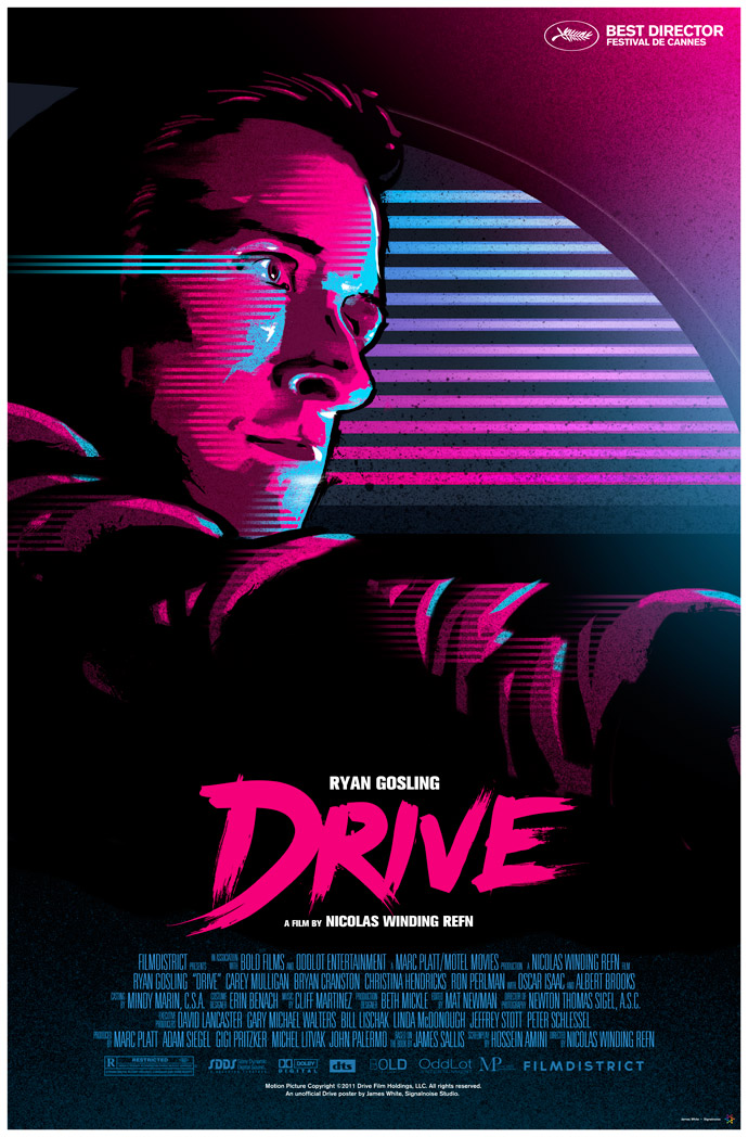
Drive, Insidious, Red State

As far as I am aware, none of these are official studio posters. And yet they're better than anything the studios came up with. Why is that? That Drive poster is one I particularly want for my wall.

The Fourth Annual Showgirls Honourary Award for Brilliance in the Face of Ineptitude in Poster Design:
The Mighty Macs

Really. So bad, yet so funny.

And that's that folks. Let's bring on a new year of gallivanting throughout the magical world of film posters!