

Coming to this year's evaluation of film posters I was scratching my head wondering what could possibly be at the top. Unlike prior years, there were no pieces of imagery that struck me in such a way that they screamed to be hailed as the best of the year. There wasn't anything like Here I Am, Funny Games, Antichrist, and so on. That's certainly a shame, but it also made compiling the list perhaps even more interesting. I literally had no idea what I was going to put at the tip top of the list, and I think it's saying something when I mention that the #1 poster of the year (as chosen by me) was one that I hadn't seen until just a few days ago. When I saw it I was besotted and I reckon you will be, too.
I admire every one of the fifty images below in one way or another - I wouldn't entertain the thought of listing them if I second-guessed myself about their quality - but I also come at this list much differently to most. You won't find a single Hollywood summer blockbuster on here, and that's not because I'm against them, I just think that this year they were mostly a pile of junk. I trawled foreign film lists, independent film award lineups, and festival fringes to find some marvellous gems including the number one poster. I think anybody doing a list of this kind owes it to themselves and their readers to do as much. The last thing I'd want to see (and I have seen them in my research) is a list that all but replicates the top twenty grossing films of any given year.
 |
| Not this year, thanks. The movie's still amazing though! |
Don't get me wrong, I am keenly aware that everybody has different tastes. I like what I like, but I would hope many of you readers wouldn't expect any less of me. Those who have been reading me for long enough probably know that I'm willing to forgive a poster for its ills if I see something unique in its design or special in its intention. I, too, have my own aesthetic preferences and if your poster deals heavily in colour and bold imagery then I am more likely to take a second glance. As evidenced time and time again, I don't so much care about a film's quality when I comes to doing a list like this. If that were the case then... well, I haven't even seen half of the titles listed (and some of the others are outright terrible). I hope that you like the list, and maybe you will discover some gems that you'd never seen before.
49. Barbara
48. The King is Dead!


47. Wuthering Heights
46. Silver Linings Playbook
45. Boy Eating the Bird's Food


44. Hail
43. Zero Dark Thirty
42. Anna Karenina


41. After Lucia
40. The Master
39. Chasing Ice


38. Francine
37. The Hunter
36. This is Roller Derby


35. The Best Exotic Marigold Hotel
34. Headshot
33. Argo


32. Django Unchained
31. Elena
30. The Color Wheel


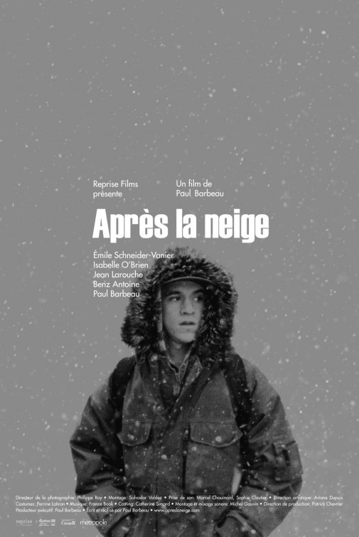
29. Apres le neige
28. The Turin Horse
27. Cabin in the Woods


26. Antiviral
25. Berberian Sound Studio
24. The Innkeepers


23. Amour
22. Amour
21. Neighboring Sounds


For not resting on its laurels. For being as blisteringly obvious, refreshingly so, just like the film.

19. Gayby
For the colourful animation that's playful, but yet alludes to shadows and distance between friendship.

18. The Imposter
For the slow-fade of the movie's theme. For the intrigue.

17. The Bay
For making the audience look twice and question themselves. For the ick factor.

16. Moonrise Kingdom
For retro chic. For feeling so lush one could touch it and feel damp moss.

15. Polisse
For the succinct representation of its themes and not resigning its marketing to simple police drama cliches.

14. Casa de mi Padre
For being a comedy with an actual comedic poster. For "Funniest Movie You'll Ever Read".

13. The American Scream
For rewarding viewers with a keen eye. For the intricacy without becoming ugly.

12. Rust and Bone
For the rustic (LOL!), rough around the edges take on complicated love.

11. Paranorman
For being cute and creepy with vivid colours. For not being shy.

10. V/H/S
For the creativity and playfulness. For taken a well worn horror poster tactic and reinvigorating it. For being so much better than the movie.

9. Project X
For giving off an anarchic vibe without slapping us in the face with its obnoxiousness. For the cheeky X (seemingly the only connection to this film being a "project x". For being so much better than the movie.

8. The Woman in Black
For being genuinely creepy and the exact opposite of the Photoshop mess that was the rest of the marketing campaign. For being a great poster for the original film as well (which, being a TV movie, never got anything like this).

7. Alps
For being weird in a cool, dramatic, designed way. For the icy silver colour scheme.

6. A Royal Affair
For being old fashioned and classically posed. For the hands, gloriously referencing the film's tug of war (and hearts). For period glamour.

5. Frankenweenie
For the IMAX juxtaposition - hi tech meets classic. For the stark, but eye-catching imagery. For being so damned cute despite being, ya know, about a zombie dog!

4. In Their Skin
For the beguiling oddness giving way to beguiling creepiness. For not forsaking atmosphere over the boo hysterics of other genre artwork.

3. The Paperboy
For the retro chic and powdered pink noir tinge. For being oh so simple, but balanced. For dripping sweat.

2. Neighboring Sounds
For diluting an entire film's tapestry (suburban security, Brazilian slice of life, neighborhood kooks) into one beautiful, striking image. For its classic, sketchy aesthetic. For featuring a cat so prominently (hey, I'm biased!)

1. An Oversimplification of Her Beauty
For the artistry. For the colours. For the boldness. For the way it holds my gaze and rewards the viewer with something fresh each time you look. For being crazy art.

And that's that. We'll get to the worst of the year in due time. Those ones are not quite as fun to look at repeatedly as I suss out rankings and edit HTML! What were your favourites of the year?
4 comments:
O som ao redor is a film from Brazil, not Argentina.
Neighborhood Sounds is brazilian, actually.
But great selection of posters! Some amazing design there.
Yay, I've been looking forward to this! I assume you only use posters for films that were released this year, not just posters that were released this year, right? I ask because I'm in love with the quad for "Gangster Squad" that you featured earlier this year.
Good choices, although "VHS" would have been number one for me. Love it. "A Royal Affair" gets bonus points for actually having the actors pose for the poster (since I assume that's not a shot from the movie).
I liked the character posters for "Lawless," especially the Tom Hardy one. Nothing groundbreaking, but a nice use of typeface and color (the gold of the brass knuckles and the glowing tip of the cigar).
"Neighbouring Sounds" is a Brazilian movie, not an Argentinian one.
Post a Comment