

Trespass

Last year this category was divided into the sexes because, I felt, the men were getting away with Photoshop murder in the face of people's hatred for another female-led movie. This year there was so much botched botox/wax figurine Photoshop that I had to smoosh the categories together. I could have easily went with another Nicolas Cage movie, Drive Angry 3D, but it felt more appropriate to choose the poster that appeared on my worst list.
Recycled Taglines - The Tree, Wuthering Heights, Drive


Brokeback Mountain's "love is a force of nature" tagline from five years back got a workout this year with these British quads for The Tree and Wuthering Heights, but this poster for Drive was also sneaky and re-used the tagline of No Country for Old Men. Sneaky sneaky. Surely these films could come up with something a bit more adventurous and original, no? I get that The Tree and Wuthering Heights are intrinsically about nature, but why be so obvious? As for Drive? That was just lazy since they had even used an alternate tagline on other posters. I'm also sick to death of seeing "An inspiring true story" / "Based on a true story" / "The true story that..." give it a rest!
Fright Night

Giant floating heads appeared to take a backseat this year, but never fear there is always at least one major contender to be found! This time it was Colin Farrell's massive smirking fave occupying the place where a sunset would normally be. Why must you take away Anton Yelchin's sunset, Colin? Why?
The Sitter

Do I really need to explain this? It's also kinda sad though because in the original - let's face it, The Sitter is a remake of Adventures in Babysitting - Elisabeth Shue's babysitter character winds up taking the children under her care to a blues bar and they must perform a song on stage in order to get away. Here it appears they wind up at a strip club. I shudder to think what they're made to do in that joint!
Martha Marcy May Marlene
From
 &
&  to
to 
So many contenders this year! Incendies, Restless, We Need to Talk About Kevin (those icky "mummy's little monster" quads from the UK!), Scream 4 and The Tree of Life were some of films that had great posters, which were then replaced by duds. It was, however, Martha Marcy May Marlene that had the biggest thud. From the exquisite first two concepts to that giant QR code masquerading as a movie poster, it was all wrong wrong wrong!
Dream House

Is there a less scary way to sell your movie than this? Yikes! I get what they were going for, but instead of succeeding it just ends up looking like a poster about A GIANT DOORKNOB! A doorknob so big that you can fit the reflections of three (THREE!) people on it (who that person pretending to be "Naomi Watts" is I haven't the faintest idea), but also make those two girls look extra diminutive. I don't get how this could work in any possible way, but what's kinda what you get from merging two blah posters into one even more blah poster.
Another Happy Day

By all means, market your movie that not many people have heard of and needs all the attention it can get by using an all white design with... I dunno, a guy with a swimming floatie? Huh? How does this sell Another Happy Day in the slightest?
Jack & Jill

"It"?
The Iron Lady

Who knew all these filmmakers slaved for months on a film project that was actually just a giant perfume commercial starring Ita Buttrose?
Big Mommas: Like Father Like Son

My flatmate can attest to the fits of laughter that I went into when I revisited this poster recently in preparation for these pieces. I laughed so much I went red in the face, but can you blame me? Apart from the dress made of police badges(?), the gun as hairclip(?) thing and the fact that even in make-up that don't look like Martin Lawrence, I think my favourite thing is the Lady Gaga reference in the tagline. I don't know what the entire thing says, which actually makes it even funnier. Are they really trying to use Lady Gaga as a way to sell the third Big Momma's House movie? Really?
Okay, so I had to choose two for this. The first (Incendies) is for, as Liz said in the comment section, "the most hilariously over-literal tagline ever" and the second (White Irish Drinkers) for... well, you'll know when you read it.


"THE SEARCH BEGAN
AT THE OPENING OF
THEIR MOTHER'S WILL"
and
"BLOOD IS THICKER THAN BROOKLYN"
:/
X-Men: First Class


Really, who authorised these? posters for one of the biggest films of the year and you release these? I hope somebody got fired.
The Descendants (Australian version)

So I guess George Clooney is someone's descendant, yeah?
The Tree of Life

It's probably fitting that so many of this film's detractors claim it's little more than a collection of beautiful images, since the studio releasing it found little else to market it on. Diminishes the film's value to little more than a slideshow of picturesque imagery with no connecting thread. Trust me, I'm glad they didn't just stick a tree on there - that would have been really literal - but by just using images they paved the way for any argument anybody could have.
The Rum Diary

For looking like a dodgy The Hangover spin off that nobody wants and looking very ugly in the process.
Blame

I would have ranked this poster higher in the top 50 if I hadn't have seen the movie. Unfortunately, I have and discovered that the film doesn't really have connection to the poster whatsoever. It's little more than a flashy way of getting the cool kids on board, but doesn't do anything to justify the design. There's nothing particularly retro about the film, nor is there any sense that the filmmakers know about the filmmakers that Saul Bass worked with. Such a shame, really.
Here I Am

There were a lot of posters in 2011 that had divine use of colour - We Need to Talk About Kevin's stark greens, Burning Man's almost pulsating and vivid blues and yellows, Bridesmaids' bold pink - but it was Here I Am that struck me the most. That burning orange juxtaposed against the beguiling mother of pearl, a pattern we never see on movie posters, just enveloped me whole.
Miss Bala

Love this design. It's smart and pulpy at the same time, deliciously colourful and tells us enough about the film to leave one intrigued.
We Need to Talk About Kevin

By all means, use Rosemary's Baby as your inspiration. It's not like it's one of the greatest movie posters ever.
Cold Weather

You don't have to chase bland, predictable Hollywood aesthetics to get a foot in the door. In fact, I'd hazard a guess that a movie like Cold Weather got a lot more of attention, at least before people saw it, for its striking poster concept than anything else. It's a great design and a far better use of whatever limited marketing funds they had than a boring poster with stripes or a floating head above the ocean.
Scream 4

"New Decade. New Rules."
Succinct, to the point, easy to get and with the right about sly grin.
Young Adult

How on Earth did I leave this one out? I have no idea, but I didn't mean to. It'd be top 20 for sure!
Melancholia

It's sad that the behind the scenes names are so rarely seen as actual advertising points (remember when writers and producers were given given marketing prominence than the stars!), so it was a given that I'd adore this poster for Melancholia that includes a picture of writer/director Lars von Trier. Bonus points for the "persona non grata" seal of approval!
Shame

If someone had had the foresight to do this concept for an actual poster rather than a mere newspaper ad then I probably would have claimed it as the best poster of the year. I love the concept and that it ties in perfectly to the material. I obviously loved the bed sheet design enough to put it in my top 50 posters of the year, but this is creative and a little bit dirty. Love it.
Drive, Insidious, Red State
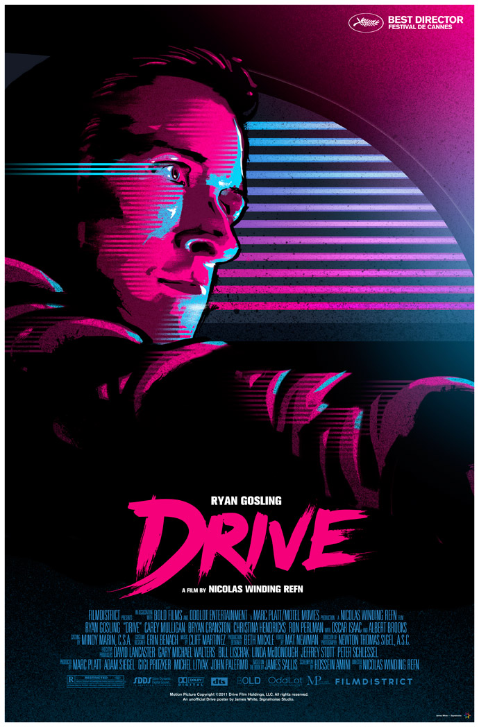


As far as I am aware, none of these are official studio posters. And yet they're better than anything the studios came up with. Why is that? That Drive poster is one I particularly want for my wall.
The Mighty Macs

Really. So bad, yet so funny.
And that's that folks. Let's bring on a new year of gallivanting throughout the magical world of film posters!
2 comments:
Good categories and even better choices.
About the best tagline - yes, I agree about Scream 4, but "La Lady Gra-Gra du FBI est de retour" is so hilarious that I would gave it second place. And I don't even know what that means! :)
PS. Here's my "Best posters of 2011" list: http://plakaty.blox.pl/2012/01/Najlepsze-plakaty-2011.html
To my mind, the excellent poster for COLD WEATHER recalls (perhaps unconsciously, although probably totally consciously) the back cover of Simon and Garfunkel's "Bridge Over Troubled Water": http://i.imgur.com/V9l16.jpg
Post a Comment