

Curating a list of bad posters is, I think, infinitely harder than making one for good posters. When you're good, you're good, and that's no matter your film's genre, budget or any other mitigating circumstances. Bad posters however... well, I feel like I have to take certain things into consideration. It feels particularly meanspirited to rub it in to a movie that barely got an advertising campaign because the distributor had no money to do so, especially when there is mainstream, Hollywood, studio dreck that somehow gets an escalating series of putrid posters. Still, bad posters are bad posters and I think this list balances that out. There are films on the list that found their entire marketing campaigns coming under scrutiny - two films occupy six spots in the top ten! - whilst there are films with posters listed below that also had entries in the best of the year list, which kinda goes to show how off base marketers can be from time to time. The below list is made up of a lot of terrible Photoshop, ugly colours, ludicrous concepts, bizarro world foreign designs, local Australian dogs, ill-conceived visuals and my traditional arch nemesis' stripes. Alas, the giant floating heads in the sky appeared to take a year off in 2011 so that one was one silver lining, yeah?
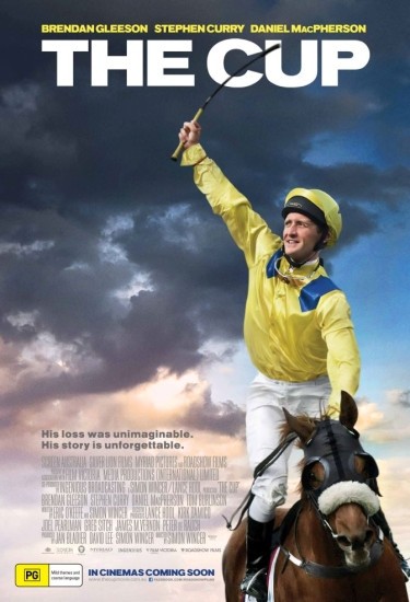
49. The Cup
48. The Three Musketeers


47. Source Code
46. Trespass
45. The Green Lantern


44. J. Edgar
43. The Dilemma
42. The Twilight Saga: Breaking Dawn Part 1


41. Zookeeper
40. Abduction
39. The Descendants


38. Martha Marcy May Marlene
37. The Tree of Life
36. Bucky Larson: Born to be a Star


35. Jack and Jill
34. Scream 4
33. The Iron Lady


32. Dream House
31. Soul Surfer
30. Arthur


29. The Darkest Hour
28. Big Mamma's Boy
27. Return to Zero


26. Don't Be Afraid of the Dark
25. The Rite
24. Justin Bieber: Never Say Never


23. Courageous
22. Straw Dogs
21. Incendies


20. I Don't Know How She Does It
For its putrid green and bizarre text: However does she find the time to "check email", "vacuum the rug" and "repair shoes"? :/

19. The Triangle Wars
For being an amateur poster of an amateur film.

18. Source Code
For being an iPad commercial for a sci-fi film. For the Photoshop.

17. New Year's Eve
For the golden laziness. For the champagne flutes as characters. For the teeth-decaying sweetness.

16. Something Borrowed
For the ZZZzzzz

15. The Rum Diary
For making Johnny Depp look positively repulsive. For the bizarre Hangover rip-off.

14. Salvation Boulevard
For the I DON'T EVEN KNOW WHAT THE HELL THIS IS!

13. A Dangerous Method
For the yikes factor. For turning the sublime transparent white version into a hard-edged, awfully Photoshopped mess.

12. The Mighty Macs
For being HILARIOUS! For being even worse than this design, which simultaneously looks like Jennifer Garner, Hilary Swank, Elisabeth Shue, Kyra Sedgwick and Teri Hatcher before it does Carla Gugino.

11. The Sitter
For the blatant sexism. For being unpleasant.

10. Big Mommas: Like Father Like Son
For the endless wedgie joke. Doubled. For being really, really stupid (why does the son have a framed photo of himself in his bag?) For the weird skinny legs.

9. Atlas Shrugged
For looking like clip art. From Word 2007.

8. And They're off
For having to be on drugs to understand it. For Sean Astin leaning up against a horse's arse. For flipping the names of the actors despite this hardly being a case of "I am Sean Astin, I must be billed first" kinda situation.

7. X-Men: First Class
For the bobblehead syndrome and the afterworld effect.

6. Barney's Version
For looking an assortment of cardboard standees haphazardly arranged. For the screepy Scott Speedman looking at me and yet not...

5. Big Mamma's: Like Father Like Son
For that "wtf?" look on Brandon T Jackson's face. For the golden seal of approval that, even though I can't read it, makes me giggle in a bad way.

4. Quarantine 2: Terminal
For looking like a melted wax statue of Laura Dern. For that vile colour scheme.

3. Big Mommas: Like Father Like Son
For being THE HORROR! OH GAWD, THE HORROR!!! The French are fucked up, y'all.

2. X-Men: First Class
For being a 0_0 of a design/concept/creation. What is this? How did this get the greenlight for a major motion picture? How?

1. X-Men: First Class
For being even worse than the one above. For sticking James McAvoy's face in the silhouette of a wheelchair-bound man's crotch. For looking like a joke and looking like even a kid would reject it. For being the worst of 2011.

What say you, dear readers? Did I forget a truly disastrous eyesore of a poster or do you think I got it pretty spot on? Let me know in the comments or on Twitter.
5 comments:
I'm glad you included the "Incendies" poster, which has to have the most hilariously over-literal tagline ever.
The "Martha Marcy May Marlene" poster with the QR code is so stupid. Was that some kind of marketing trick? At least the other posters were terrific.
It really annoys me that they went with that "J. Edgar" poster. I saw another one with an American flag as the backdrop and Leo's face set in kind of a grainy texture. Not great (mostly because that shot of Leo is just horrible), but it at least had some kind of design aspect to it. This one is just...nothing.
I'm a little surprised to see the "Tree of Life" poster on your worst list. I agree that the one with the baby's foot is better, but I do think this one captures the "snapshot"-ish quality of the film.
Oh my God they're so awful. I don't know what they were thinking with The Mighty Macs, And They're Off and Salvation Boulevard. I just don't get it. And those X-Men posters! You know they had the resources to create something better.
And all these messes were made by people who got paid for doing this. Money was given to them. For this.
I don't know what kind of world I'm living in.
Liz, isn't it just? That Incendies tagline is... wow. As for The Tree of Life, I just find it lazy and completely sells the film short as little more than "a bunch of nice pictures".
Inaki, I actually know someone who had a brief hand in that Salvation Boulevard poster. Can you believe it was once worse?
Hi Glenn, here's my selection of worst posters of 2011:
http://plakaty.blox.pl/2012/01/Najgorsze-plakaty-2011.html#ListaKomentarzy
Looks like we can agree, especially when it comes to THE worst poster :)
Great list! Never saw those hilarious X-Men: First Class posters - do you know where/how they were used?
Ps I must admit that I was also surprised at the inclusion of The Tree of Life poster. But I like your explanation at least.
Post a Comment