Showing posts with label Black Dahlia. Show all posts

Monday, January 7, 2013

Fiona Shaw's Gangster Squad


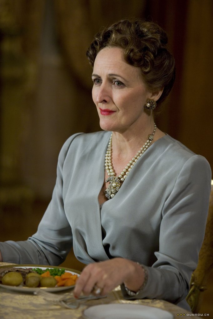
Did you know, Mr Bleichert, that Ramona Boulevard is named after me."
"I didn't."
"When Emmett married me for my father's money, he promised my family that he would use his influence with the city's zoning board to have a street named after me. But all he could manage was a dead-end block in a red light district. In Lincoln... Hhhh-eights. Are you familiar with the neighbourhood, Mr Bleichert."
"I grew up there."
"Yes, well, then you'll know that Mexican prostitutes expose themselves from windows. I hear many of them know Mr Liscott by name!"
"Shut up!"
"I will sing for my supper when Mayor Bowran comes to dinner, but not for Madeleine's male whores. He's a common policeman, my god! How little you think of me.

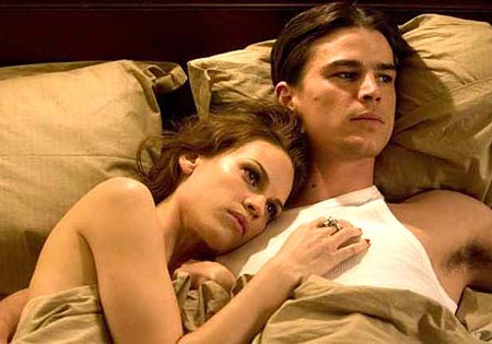
The above is a transcript of one of Fiona Shaw's two incredibly memorable scenes from Brian De Palma's 2006 retelling of the famous "Black Dahlia" murder. It is inarguable one of just many incredibly odd scenes to be found across De Palma's altogether messy film, The Black Dahlia. A film that reached such sky high levels of badness that it veered directly into unintentionally camp laugh riot. Shaw, it would seem, is the only actor the whole affair who was able to see what film was being made and went about not only stealing it outright from everybody else, but doing so in a style that continues to amaze me to this very day. In just two brief scenes Fiona Shaw was able to give The Black Dahlia a legacy of some sort beyond being a pretty failure. One person once described her as an "utter loon" and who could argue with that? I know many hate this movie - and with good reason, I'd suggest - but I enjoy it as an exercise in complete and utter foolhardy, Hollywoodised rubbish. Shaw is the lone star amongst a collection of dull, imploding masses of clay (I'm looking at you Scarlett Johannson, Josh Hartnett, Aaron Echkart, and Hilary Swank as a ridiculously unsexy Russian lesbian who doesn't for a single moment look "just like that dead girl", no matter what Johansson's playing-in-mummy's-wardrobe performance would have you believe.)

I bring up The Black Dahlia because last night I saw Gangster Squad, new film by Ruben Fleischer (Zombieland) that got shafted to a January release date after the shooting tragedy at a Colorado movie theatre. Set two years after the events of The Black Dahlia, Gangster Squad shares a similarly styled aesthetic, although one that lacks the lush intricacies of Dahlia. Dione Beebe's overly computerised digital photography and the overly artificial sets don't have any of the eye-popping class of Vilmos Zsigmond's Oscar-nominated cinematography or uniquely specific sets from De Palma's movie. Mark Isham's musical score for the latter is equally fine, especially compared to Squad's Nolan-inspired boom score from Michael Bay collaborator Steve Jablonsky. If the actors are by and large better in Gangster Squad then that's more an indictment of The Black Dahlia, but they still fail to enliven a fairly mediocre movie. Emma Stone looks particularly lost at sea playing a sexy dame with eyes for Ryan Gosling's bad boy cop. That her entrance is a replication of Michelle Pfeiffer's breakthrough into cinema history in Scarface does her little favours.

Still, the film's biggest problem is its tone. Whether this is a result of having to (literally) go back to the editing room and recut the film to, at least, remove any trace of the infamous cinema shooting scene that caused such a controversy after the Aurora massacre, I'm not sure, but I think it's fair to say there was a problem long before that tragedy unfolded. I suspect there's little coincidence that Sean Penn's villain (as well as many of his henchmen) resemble Dick Tracy characters, but why then not go all the way and give the film an entirely cartoonish quality? It certainly would have made some of its more excessive directorial flourishes more palatable. I craved a scene or two that was as maddeningly bonkers as Fiona Shaw's inclusion in The Black Dahlia. I longed for a scene as deliciously in your face and technically savvy as that film's long take as the body of Elizabeth Short was found. Sadly none were to be found.

Similarly, if it's not going to reach the crazy end of the pool, why not go serious and aim for LA Confidential or The Untouchables? It's not as if the cast was wanting for something serious, but the no man's land that Gangster Squad finds itself in does nobody any favours. By the time Josh Brolin's leathery hide was chasing down buggies and latching on them like he was T1000 I'd long since given up interest. Which is a shame, but not altogether unsurprising. The aforementioned cinema scene looked like a film peak from the trailer so its exclusion is as disappointing in that regard as it is unnecessary. But, there's nothing they can do about it now. C

I will say this though: Gangster Squad's end credits are fabulous. It's not actually a diss to say they're the best part of the film because they're genuinely excellent. They were done by a company called Scarlet Letters and if you do go see the film please stay and watch them all.


You show 'em, Fiona!

Thursday, January 14, 2010

Top 50 Posters of the Decade: #50-26

You knew it was coming! I couldn't let the end of the decade pass and not do a list of the 50 best posters from the past ten years. Get ready for pure and utter gorgeousness. Now there is going to be obvious overlap with my 100 Greatest Movie Posters countdown from 2008, however, as with any list, if I had done that of any other day things would be difference and, thus, there are post-2000 titles on that list that appear further down on this list than you would think they should be. That's just the way it goes.

Honourable mentions? There are many. 25 to be exact. Consider them ranked as top left being #75 and bottom right being #51, but I didn't really put as much thought into them as I did the top 50. I will be posting numbers 50-26 today and the rest tomorrow. Enjoy.


50. Secretary

While so many people are eager to hoot and holler that Polish and Czech poster are where it’s at with their designs that mean nothing and their ugly aesthetics (well, a lot of the time, anyway), I actually think it is Asia that is producing the best alternative designs. You'll notice several of them on the list including this hot pink polka dot infused design for Secretary.

49. Dancer in the Dark

The most original design for Lars Von Trier's musical masterpiece, and one that subtly hints at the emotional wringer that audiences will be put through.

48. Adaptation

My admiration for this design as gone downhill quite a bit in the years since it first came to prominence. I still love the smudged text and my admiration for the Nicolas-Cage-is-Shattering thing has subsided since I've started to follow poster design closely. It's a great design, don't get me wrong, it just feels like the intervening years are lessened its specialness.

47. Saw

The original and the best. Am I talking about the films or the posters? Take a pick. However, in the realm of poster design the original started the trend and the rest are just following suit. Unless you're a hardcore anti-horror then I doubt you can say this didn't make you sit up and take a moment when you first saw them.

46. Sexy Beast

Doesn't this just make you chuckle? A little? Especially if you have seen the film and know what it's about.

45. Jesus' Son

While I have not seen Jesus' Son, I am lead to believe that it is not all sunshine and rainbows, and yet to incorporate such bold ideas onto this design takes guts.

44. Good Night, and Good Luck.

Perhaps the true star of key art design this decade gone was Jeremy Saunders. He has four designs on the countdown, but it could have been more. This uber-cool retro design for George Clooney's film should be used around the world, but it wasn't. Of course. Thankfully the international crowd seems to be catching on to this Saunders fellow.

43. Valentine

A dud of a movie, but like a lot of genre product, it has a solid and key piece of central design. Plus, dolls are creepy.

42. Swimming Pool.

It's got sex and it's got mystery. That's pretty much it.

41. The Prestige
40. Moon

Two hypnotic designs (for two equally impressive films, I might add) that add extra dimensions and texture to films that could have easily been marketed in a much more standard and stereotypical manner.

39. A Christmas Carol

Does a great job at selling the movie as the darker film it (apparently) is. If this were a horror movie I'd think it was even better since I actually get a bit of a chill from it, don't you?

38. Dave Chappelle's Block Party

A poster that shows off the film's joyous celebration of life mentality. I like that the musicians are in black and white with colour shooting out of them as if to say "all this colour and life can come from something gray." If you want.

37. Requiem for a Dream

It’s certainly “EYE” catching, isn’t it? Ba-doom-ch!

No, but seriously, for a poster that utilises the dreaded stripe design AND movie-still-as-marketing-device it works shockingly well. It kinda haunts and alludes to the film's crazy scattered mind.


36. The Dark Knight

I KNOW! How dare I put a poster from The Dark Knight so incredibly LOW on the list? I might as well just shoot myself now. And not even the "Why So Serious?" one, too? Yada Blah Etc.

35. Kill Bill, Vol. 1

Iconic and instantly recognisable. Probably the best use of block colour on a poster for the entire decade.

34. Lost in Translation

This poster - my preferred of the two major posters for Sofia Coppola's Lost in Translation - conveys so much. The loneliness, the culture shock and the bewilderment all in a colourful and eye-catching design. It even has a dinosaur! And that tagline, "Everybody wants to be found", is bliss when it easily could have been "In a foreign land, two souls will connect" or some bull like that.

33. No Country for Old Men

Somehow it was Asia that had the bright idea to market the Coen Brothers' film on the ideas of American gothic. A much darker idea than the more recognised American posters and one that gives light to the shattering of an American ideal. Wonderful.

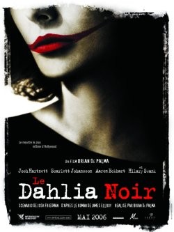
32. The Black Dahlia

There were many great designs to Brian DePalma's absurd loony bin of a movie, but this my favourite. Creepy and direct with a hint of retro.

31. High Tension

High saturation, high promise of horror and high visual panache. It works at showing off the film's grungy and violent appeal (even if the film is actually quite retched). Cecile de France looks super-imposing and I love that blood splatter at the barbed-wire end of her weapon.

30. 3:10 to Yuma

Yes, it looks like it's advertising a Bob Fosse western, but I think that's what makes it so brilliant bonkers. You have flamboyant gun toters, text running in all sorts of directions, random objects and one of helluva sight gag. Incredible inventive for a movie of a genre so indebted to history and formula.

29. In the Mood for Love

For a movie that is bathed in colour to use just ONE seems like it shouldn't work, but it does. That deep red is just dreamy and with Maggie and Tony all but sinking into it? Heavenly...

28. Code Unknown

Sometimes Michael Haneke films have incredible marketing, and other times it's as if nobody has any idea how to sell it. This design for Code Unknown is quite stunning in the way it represents the themes of the film (it is one of my favourite Haneke films for what it's worth) and the vague disappearing act that characters in this and all Haneke films seem to go through.

27. The House Bunny
26. The 40-Year-Old Virgin

Ever since Steve Carell looked up slightly to the left in the mall photo house-inspired poster for The 40-Year-Old Virgin (note: correct grammar) in 2005 the design has been aped, repeated and copied so many times that it is impossible to count. A lot of the time it has been done by Judd Apatow's own production house. However, nothing beats the original, although Anna Faris looking hilariously dumb on the poster for The House Bunny certainly came close. Just looking at them is bound to raise a giggle or five.

Make you come back tomorrow when we count down from #25 all the way to the best poster of the decade! Feel free to leave a comment!

Saturday, December 2, 2006

Cinema of the Absurd: The Black Dahlia

THE BLACK DAHLIA (2006, dir. Brian De Palma)


It’s been over a week now since I saw Brian De Palma’s The Black Dahlia and, as others have mentioned, it’s a very confounding picture. It’s not the type of movie you just sit down and whip up a few hundred or so words about off the cuff. It’s an incredibly strange creature of a film, if you can even call it a film. I mean, it has all the traits of a film – actors, sets, costumes, dialogue, etc – but I can’t possibly think of any movie it even slightly resembles. There are similarities between it and many others, but The Black Dahlia is a truly one-of-a-kind experience. It’s not a movie you should sit down to watch if you want coherence, acting or a clear resolution. No. It’s the sort of film you sit down to watch and just let it wash over you. Just dive head first into the wacky tobacky bong water that De Palma was clearly drinking on the set.

The Black Dahlia is a movie at seemingly complete odds with itself. Consider. On one hand it is so professionally tailored, yet nobody and nothing quite fits. The lead roles are all filled by hapless wolf in sheeps clothing actors yet the fringes are filled with electric, vibrant performances. De Palma has crafted many astonishing memorable sequences yet they seem more like jigsaw pieces just kind of floating around being placed anywhere at whim without any thought as to if they fit or not. The movie plays itself as the mystery surrounded the Black Dahlia herself yet at some times it feels as if De Palma (and screenwriter Josh Friedman, it must be noted) loses interest and just films whatever he wants cause the cast showed up to the set. On one hand the central mystery is such a mindbogglingly confusing maze, yet when it comes down to the murderer’s reveal it’s as if they just played eeny-meeny-miny-mo with the cast.


This movie really has no idea where it’s going until it realises the 2 hour mark is approaching and they have to end. Characters disappear because… well, we don’t know. They get throwaway lines alluding to a drug addictions or a deep dark secrets or such and such yet nothing is made from it. Scenes take place that lead nowhere. De Palma just gets bored half way through a scene and cuts to something else that he thought looked pretty.

This is truly inept filmmaking. But, ya know what, it’s totally fascinating. I dare a hardcore cinephile to sit down and watch this movie and not find something positively riveting. Sure, when all is said and done, the movie is a wreck, but what a wreck. It’s hilarious. Watch as actors like Scarlett Johansson, Hilary Swank, Josh Hartnett and Aaron Eckhart play around in Mummy and Daddy’s clothes (even Eckhart, approaching 40 seems out of place). Swank puts on a curiously shapeshifting accent and wig. Johansson amps the cleavage up to 100 but drowns in all her cashmire and fur. The camp drag queen appearance skyrockets with it. Hartnett drowns in said accents, cleavage and cashmire. And Eckhart? Well… he plays his character as if he’s just been to a 1940s sleuth movie marathon and he decided to impersonate the lead actors to the nth degree.

People will compare it to LA Confidential and that movie was positively in the era. The Black Dahlia is sort of just transported into the area and the cast seem to be doing whatever they can to fit in. It’s sorta hilarious.


But as I’ve said, next to all the bad, there is fascinating bizarre stuff. Fiona Shaw plays a character that is so unhinged that it’s amazing she even exists in his movie, or any movie at all for that matter. If I thought The Black Dahlia was unlike any film I’ve ever seen before, then Shaw’s performance (as Swank’s slightly perculiar mother) is an even deeper form of crazy. She only appears in two scenes, but when she’s there (from the very first shot of her) the film jumps several tracks and becomes the deranged David Lynch noir that is just begging to get out throughout – think of Grace Zabriskie in Twin Peaks and you get a similar idea. Shaw’s performance is the very definition of a Supporting role. She takes the films by the horns and does what the actual leads should be doing. She makes everyone else around her look better simply by being in her presence. It also helps that it’s probably the funniest performance of the year too (funnier than Cohen, Jacobson, etc). It’s essentially what Gina Gershon did in Showgirls, but with less tit flashing.

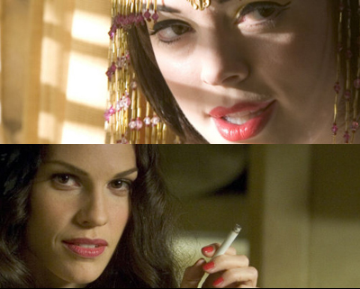
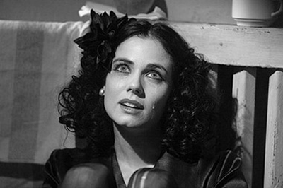
Mia Kirshner gives good work too as the Black Dahlia herself seen in flashbacks as sad sorry little creature. She reminded me of Laura Palmer (again, from Twin Peaks) in that she new she was heading down a rabbit hole she couldn’t get out of. Rose McGowen shows up briefly to show us why she should be the go-to-gal for big-breasted witty characters. kd lang even shows up to sing an exotic version of Cole Porter’s “Love For Sale” surrounded by erotic female dancers (a funny touch, I thought.)


And there’s no denying that the film is, essentially, flawless when it comes to things such as art direction, costume design, cinematography and music. And all that just continues to fascinate. When you’re not staring at the beautiful scenery you’re holding back tears of laughter from the stupendous acting and dialogue. When you’re not devouring the many, many, many stunning and memorable individual sequences (I haven’t even discussed them! I could talk for hours…) you’re getting whiplash from wondering how the previous scene lead to the next.

Movies like The Black Dahlia are rare. A movie so hopelessly bad, yet it is because it’s very badness that makes it so fascinating. It would’ve been easy to make a mediocre movie, but everybody is trying to infinity and beyond that I am reminded of that old quote: “Shoot for the moon. Even if you miss, you’ll land among the stars.”


On the Absurdity Scale from 1-5, I rate The Black Dahlia a 4
It's stupendously absurd!
For a proper grade? B+ (or C- if you don’t have a sense of humour)