I'm having a look at the best and the worst posters that we saw in the year 2007. There were some very amazing ones. Some very not so amazing ones, too. Some of these won't come as much of a surprise to long-time readers as I am highlighest them in in "When Bad Posters Strike" and "Well Played Poster" features, but there are some that I haven't even mentioned, let alone praised. So, let's get started, shall we?
(All posters accumulated from IMP)
THE TEN BEST POSTERS OF 2007
10. El Cantante

I've liked this poster since I first saw it. I think it's just so distinctive and the colours pop. Love the colour of Jennifer Lopez's lips and eyelids. It all looks so suitably retro (i love curved corners on posters) and they have somehow made Marc Antony look like he has a pulse!
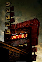
Reminded me of the equally fantastic poster for Rob Zombie's (I imagine) far superior The Devil's Rejects. Love the dank grungy vibe that the poster has. A poster for a scary flick that's actually kind of scary? UNHEARD OF! Plus, the lack of floating heads is a nice change.
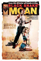
I had liked this poster from the moment I saw it, but then I saw it at a tram stop in Melbourne and just thought it was so audatiously brilliant. Plus, that tag line - "Everything is hotter down south" - overflows with amazing.

An unabashedly political film gets a poster that is equally as politcal, yet doesn't get bogged out in it all. Just look at the posters for other Iraq-themed films like In the Valley of Elah and Redacted and you'll see what I mean (hopefully).

Yes, I know very well that Richard Corben's original design has been mocked, propped and imitated to nigh on absurd levels (Posterwire has a great piece about it, actually), but I think there's an altogether new quality to it this time, when applied to the Aqua Teen Hunger Force movie idea. Plus, take a look at the credits block at the bottom of the poster - GENIUS! How they got away with it, I'm not quite sure though...

This foreign design for Love in the Time of Cholera is my favourite - hell, it's the only good one - because of, you guessed it, the colours. So rich and vibrant, I can't recall seeing a poster with all these yellows, lime greens and orange-reds on it before. I wish I could expect more to come, but I don't see it happening, unfortunately.
Yes, it looks like it's advertising a Bob Fosse western, but I think that's what makes it so brilliant bonkers. What the hell is going on with this poster. I wish more mainstream movies were this inventive and kooky with their marketing. I mean, you have flamboyant gun toters, text running in all sorts of directions, random objects and one of the best sight gags on a poster all year. I choo choo choose this poster as one of the year's best!

Previously discussed here. This poster freaks me the fuck out!!

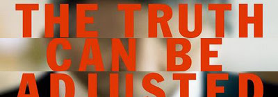
"Oh my god! Michael Clayton is fading before my very eyes!" No, not really, but I imagine that's what the smart cookie who designed this poster (someone at Pulse) was trying to get across to the casual person walking through the megaplex lobby on their way to a fascinating screening of Good Luck Chuck. No? Whether people "get" it or not (I guess you do sort of need to see the film to actually understand that angle of it all) it's still a fascinating and beguiling poster. The big orange text "THE TRUTH CAN BE ADJUSTED" speaks volumes and the look on Clooney's face (albeit, his blurred face) shows so much that you can't help but wonder what he's up to. I have a feeling that this design is going to be replicated a few times over the coming year.
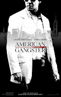
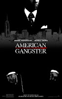
Previously discussed here. You can click on the link to the left to read why American Gangster is the best poster of the year - and I'll be doing it all again very soon nudgenudgewinkwink - but, needless to say, they are exceptionally designed, superbly executed and altogether brilliant posters. In my mind I had purchased my tickets the moment I saw them.
(excluding previously mentioned posters)
Classiest Poster
Away from Her

A beautiful image for a beautiful film. You may not even notice the fact that Julie Christie (and the title itself) are fading away.
Runner Up: There Will Be Blood
Best Rip-Off
30 Days of Night
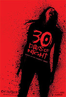
For ripping off the posters of 300 and actually improving on them! Way to go!
Best TV Poster
Damages

Better than most film posters, if you ask me.
Runner Up: Terminator: The Sarah Connor Chronicles
Funniest Poster
Sicko

"MAN LANDS ON MOON" is effectively funnier than twenty thousand posters with Will Ferrell pulling a goofy pose or showing off silly hair. But that's just me.
Runner Up: Teeth
Best Grindhouse Renaissence
Machete

I've seen a few posters for "grindhouse movies" in my internet travels and this one for the fake Machete is not only the best from 2007, but better and more authentic than any for Death Proof or Planet Terror.
Runner Up: The Strangers
Dreamiest Use of Colour
My Blueberry Nights

...sigh...
Runner Up: Tears of the Black Tiger
Best Use of a Gas Mask
28 Weeks Later

Runner Up: Right at Your Door
Worst "Empty Space" Poster
Margot at the Wedding

Previously discussed here. It's just so... empty!
Runner Up: Alpha Dog
Worst Backtracking
The Invasion


They went from the intriguing classy teaser poster to... that... thing... whatever it is. The top half is good, the bottom half is like some twilight zone poster. Very strange.
Runner Up: There Will Be Blood
Premonition

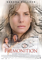
I just have to laugh everytime I think of the original design of Sandra Bullock's face being made up by twigs and birds (itself quite comical) being turned into the biggest giant floating head poster of the year.
Bridge to Terabithia
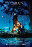
I was shocked to find out Bridge to Terabithia wasn't actually animated and was, much to my surprise, live action. Coulda fooled me judging from the poster. And then if you've seen the trailer and the movie you can point to another "false advertising" angle. They just did not know how to market this swell little movie did they?
Runner Up: I Know Who Killed Me (what movie is that advertising?!)
The Ex

Zach Braff looks like an oompa loompa. Who allowed this to go to print?
Runner Up: Good Luck Chuck
The Savages

So, what? Because the guy at the New Yorker does your poster you're instantly one of the best of all time? Puh-lease.
Runner Up: Saw IV
There Will Be Blood
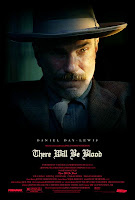
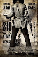
What a disappointment compared to the teaser.
Runner Up: Ratatouille
The Reaping

I still can't quite put my finger on why this tagline is so... "off".
Runner Up(s): September Dawn and Fracture
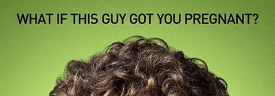
Knocked Up (runner up)
"WHAT IF THIS GUY GOT YOU PREGNENT?"
Michael Clayton
"THE TRUTH CAN BE ADJUSTED"
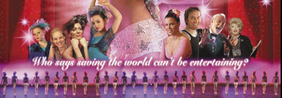
Razzle Dazzle: A Journey Into Dance
"WHO SAID SAVING THE WORLD CAN'T BE ENTERTAINING?"
The Simpsons Movie
"SEE OUR FAMILY, AND FEEL BETTER ABOUT YOURS" (winner)

Southland Tales
"THIS IS THE WAY THE WORLD ENDS"
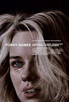
August, Funny Games

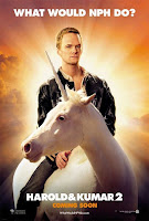
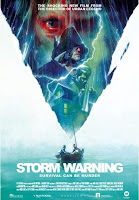
Harold & Kumar 2, Storm Warning
10. Behind the Mask

I just find this poster really ugly and unappealing. Not ugly in a "this grotesqeness makes it scary" way, but in a "I don't wanna watch this movie because I might get an infection from it" way.

The look on Mandy Moore's face speaks volumes.

I can't type much for this because I am actually falling asleep just from looking at it. Morgan Freeman is wise, doncha know!

Ditto. Phillip Seymour Hoffman is so chameleonic, doncha know!
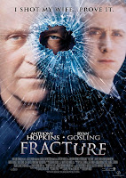
Previously discussed here. Looking like a low-rent direct-to-DVD title, this poster for Fracture is just so by-the-numbers and with that ridiculous tagline ("I killed my wife... prove it" - aagh!) just makes me want to never see this movie.
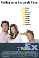
Previously discussed here. Zach Braff's orange face. The abundance of empty white space. The unexplained shortness of Jason Batemen. The listing of every single cast member of any remote "name value". All adds up to zero. I prefered it when it was called Fast Track - at least that poster had something going for it.

I'm sure blue flowers play some part in I Know Who Killed Me, but it's lost on me and - I'm quite sure - everyone else whos aw this poster in the cinema lobby. With more work on it and a better idea of what it represented and this design could've been something unique, but as it is it's just... well, I don't know. What are they even trying to market there?
Take your pick of any number of Hostel Part II posters. They're all as revolting as the last. I still refuse to put them on my blog. They're disgusting - and, obviously, not in the scary/intriguing/mysterious way. They're just vile.
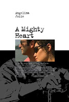
Previously discussed here. I thought this hopelessly DIY poster couldn't be beat for worst of the year honours, until I saw the #1 poster. Still doesn't stop this poster for A Mighty Heart being ridiculously simplistic made-on-the-cheap disaster.
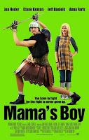
I'm speechless. I mean, it looks like it was made in Microsoft Paint for crying out loud! The eye-searing colour, the ridiculous pose by Jon Heder (go away forever plz) and just nothing about it makes you want to see the movie (right?) The boring font, Anna Faris' annoying dress/denim ensemble, the names "Diane Keaton", "Jeff Daniels" and "Anna Faris", the rudimentary waste of space... everything. It's just terrible. Quite possibly the worst poster ever made.
Well that was a lot of fun (and a lot of hard work). Hope you all enjoyed it. I'm sure I've missed something, but I can't help that. Did y'all have a favourite/least favourite poster of the year?
