

It's distressing when compiling a list such as this and I come to realise that almost any poster featured within the entire top (bottom?) 50 could have been a legitimate contender for worst of the worst. Literally, take your pick and it was a bona fide "worst!" pick at any given moment. I'm not as much a doomsayer as some others when it comes to the art of film key artwork, as I feel every year I have proven there is a substantial number of designs (and specific designers) that are original, unique, interesting, and feature a style worth paying attention to. This year, however, as I made up the list, it really did appear as if the bad designs just kept on coming and coming.
Whether it's bad Photoshop, bizarre spacial arrangements, disinterested star power, or ugly aesthetics, all 50 of the following posters remind me of Satanic garbles from one of those possessed idiots in The Devil Inside (which, yes, features twice on the list). Like the deranged flip side of my favourite poster biases, there are some posters below that bask in garish colours and simplicity that is actually just laziness. All of the 50 images below are an insult to the eyes, and no matter the budget of the film in question ($200mil John Carter; presumably miniscule Leave it On the Floor) they remain unforgivable and inexplicably released to the public. Enjoy, or, better yet, don't. Just shake your head and wonder where it all went wrong.
49. Katy Perry: Part of Me 3D
48. Hope Springs


47. Parental Guidance
46. Men In Black 3
45. House at the End of the Street


44. Alex Cross
43. Killing Them Softly
42. Bait 3D


41. Joyful Noise
40. What to Expect When You're Expecting
39. Any Questions for Ben?


38. A Fantastic Fear of Everything
37. The Perfect Family
36. The Babymakers


35. Lay the Favorite
34. Here Comes the Boom
33. Keith Lemon: The Film


32. Tyler Perry's Madea's Witness Protection
31. John Carter
30. Housos vs Authority


29. So Undercover
28. Journey 2: The Mysterious Island
27. The Intouchables


26. Bait 3D
25. The Woman in Black
24. The Devin Inside


23. The Decoy Bride
22. Stolen
21. Battleship


20. Lawless
For being the yearly "Weinstein Fob Off". For the ugly-assed placements (the cast on the vest!!!). For covering Tom Hardy's face with an ugly hat.

19. Playing for Keeps
For the hideous colour uncoordinated panels. For a tagline that begs a response of "NOT THIS!"

18. Think Like a Man
For the OMGSOMANYPEOPLEAAAAAGGH! For terrifying me with this when I went to get a file.

17. Intruders
For failing miserably at whatever it was doing. For serious? For not being scary at all.

16. Alyce
For making want to get a tetanus booster just by looking at it.

15. The Door
The being so entirely drained of imagination. For not even attempting it.

14. Cowgirls n Angels
For shamelessly cribbing off of every other little-girl-and-her-inspirational-pet poster. For just everything.

13. Outside Bet
For... take your pick.

12. The Man Who Shook the Hand of Vincente Fernandez
For the indignity. For the colour palate brown.

11. The Twilight Saga: Breaking Dawn Part 2
For that Photoshop. For the hilarious running action still. For being over.

10. The Cold Light of Day
For being cheap and lazy. For Terminator Sigourney.

9. Dark Tide
For being... overt.

8. Fun Size
For being a fake tanned hot mess for bad Photoshop and bizarre use of space. For the superhero baby who's actually an eight-year-old child (whod've thunk it?)

7. Freelancers
For... well, do I even have to say it?

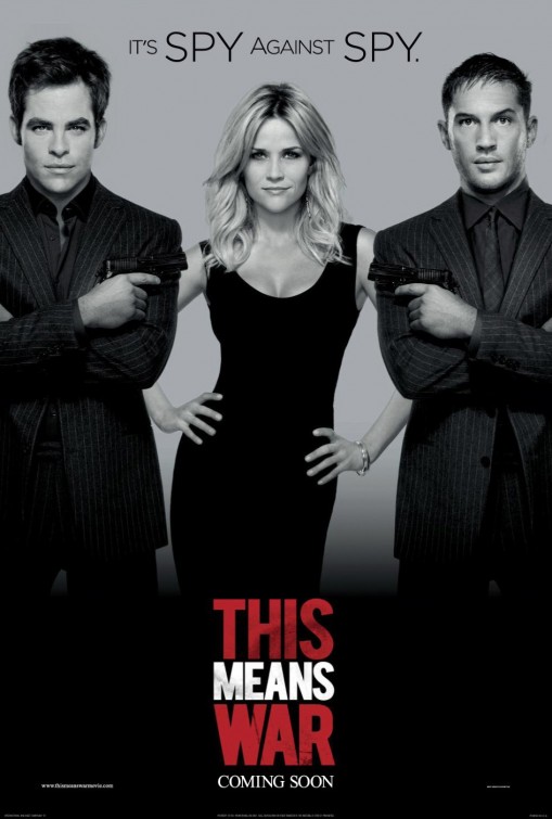
6. This Means War
For being ugly for the most part, but also for having the year's most egregious use of Photoshop imaginable. For not even bothering to hide it.
5. Leave It On the Floor
For "Featuring SWEET DREAMS by BEYONCE". For being one big ol' gay mess.

4. The Devil Inside
For making me want to get ANOTHER tetanus booster.

3. Quartet
For being "part 1980s anti-apartheid concert poster, part Dulcolax ad." (thank you Guy Lodge!)

2. 360
For making a terrible concept even worse. For being so goddamn fucking ugly.

1. Freeloaders
For everything. For having its own star ask "is that real". For everything.

And how about you, dear readers? I know I've forgotten something (I always do), but this year had a particularly, er, stellar crop to choose from.
3 comments:
I figured that Freeloaders poster would take the top spot, but holy crap, there is a lot of worthy competition on this list. Nicely done. Now I need to scrub my eyeballs, I think.
I find that "Intruders" poster completely repulsive. Not only is it ugly, but it actually makes my stomach churn when I look at it.
So glad I could help out with Quartet -- thanks for the shout-out! So many worthy (which is to say wholly unworthy) picks here.
Post a Comment