Thursday, April 22, 2010

Review: Hot Tub Time Machine

Hot Tub Time Machine
Dir. Steve Pink
Year: 2010
Aus Rating: MA15+
Running Time: 100mins

Two weeks ago cinemagoers had Steve Carell and Tina Fey starring in Date Night, a movie with a plot that came directly out of 1986. This week fans of dopey comedies can, quite literally, go back in time to 1986 with Hot Tub Time Machine, a terminally unfunny piece of nostalgic time travel that throws everything except the kitchen sink into the hot tub resulting in nothing more than a soggy mess. When the title is the funniest thing about a movie, you know there’s trouble afoot.

Read the rest at Trespass Mag.


I had mentioned to fellow Melbourne film man Luke Buckmaster before the screening that I was not looking forward to this movie and, lo and behold, it turned out to be as bad as I expected. I truly, honestly did not laugh one single time. Say what you will about Date Night, I already did, but at least I laughed during that one in spite on how badly made it was. This one is just drab and uninteresting and doesn't even seem to raise a sweat, but here chugs along at its own pace and then ends. et voila. One thing I didn't get space to write about is Lizzy Caplan. She shows up in 1986 as a woman that steals John Cusack's heart, but then when we see her in 2010 (or whatever year it is set since the maths is way off) she looks exactly the same. In those 20 years did she invent a product that stopped aging? It was kinda scary. D-

Tuesday, April 20, 2010

Review: Animal Kingdom

Animal Kingdom
Dir. David Michôd
Year: 2010
Aus Rating: MA15+
Running Time: 112mins

Australians love a good crime drama. Hell, judging from the TV ratings they love even bad crime dramas, crime documentaries, crime comedies, crime anything as long as it features people getting themselves in too deep with drugs, violence, sex or the inability to drive properly. And yet crime seems to only pay on the small screen, what with big locally made hits such as Underbelly, Border Patrol and City Homicide sitting pretty alongside international fare like Bones and Midsummer Murders at the top of the ratings heard. Give audiences a body - or, preferably, an ever-increasing pile of them - and they're on board.

For some reason, this predilection to crime hasn't jumped to the big screen in any major way, until now, with David Michôd's debut feature Animal Kingdom. Sure, Matthew Saville ventured there with Noise (the second best Aussie film of the last decade) sort of went there, but not to the level of Animal Kingdom. Lazy people - such as myself, I admit - will describe it as "Underbelly on the big screen" and they're not too far off the mark if you mean a slickly produced, invigorating product featuring a bevy of talented acting heavyweights of the Australian acting industry.


Set in Melbourne, Animal Kingdom begins with teenager Joshua "J" Cody (James Frencheville) being moved to live his grandmother (Jacki Weaver) after the death of his single mother. The mother who had intentionally sheltered J from the life of his grandmother and uncles. He soon becomes indoctrinated into the family business of armed robbery and drugs. The young and easily influenced J is quickly pounced upon by police Senior Sergeant Leckie (Guy Pearce) and is caught between his family and the law. Michôd's screenplay is such a fine, solid base and yet it weaves unexpected sidetracks alongside the intricate plot. Michôd has a knack for dialogue here and each character has such a strong, defined persona, which is something that a lot of films tend to lack. These characters live and breathe, and feel as if they have been for decades.

The movie is impeccably made from a technical standpoint with Adam Arkapaw's cinematography looking so crisp, there are several shots worthy of art. The sound work was, I found, particularly note worthy as was the editing by Luke Doolan who manages to wring so much tension and shock, especially during one scene in which Clayton Jacobson reverses out of his garage. Sounds simply, you will understand when you see it, but it walks such a delicate line of nail-biting suspense. Impressive too is the wonderful cast that Michôd has assembled. Perhaps Ben Mendelsohn is miscast as the elderly brother Pope, and perhaps Frencheville has some strange character traits that are hard to define (is he autistic?), but Joel Edgerton is excellent in a role that I am sure many will spoil, but I will do no such thing. Luke Ford, the brother from The Black Balloon, impresses in what is probably the weakest character while Sullivan Stapleton, Susan Prior and Laura Wheelhouse provide great support too.

The performance of the film, however, is Australian acting legend Jacki Weaver. Instantly recalling recent towering performances by the likes of Mo'Nique, Weaver spends much of the film's first half being quietly creepy and, at times, even gothic, but she proves to be merely biding her time before unleashing a flood of evil in scene after scene leading up to the film's haunting conclusion. The way her lips curl as she tries to keep a motherly smile on her face as she extorts, blackmails and manipulates the walls that are crumbling around her is a sight to behold. It is sure to be remembered as one of the finest displays of acting ever committed to an Australian film.


Unfortunately, I do think that the character of J is what lets the film down during these final passages. His character, not necessarily Frencheville himself, feels messy towards the end and the way the character navigates the twists that the film has in store isn't done as cleanly as one would expect from this otherwise finely crafted film. Sure to become a definitive title of Australian film for what it's trying to - and mostly does - achieve, Animal Kingdom is a superb film that should once and for all get audiences excited about Australian cinema once again (even though they already should be). B+

Animal Kingdom is release 3 June, but I'll remind you about it so don't worry!

Thursday, April 15, 2010

Review: Were the World Mine

Were the World Mine
Dir. Tom Gustafson
Year: 2008
Aus Rating: M
Running Time: 95mins

The likes of Todd Haynes, Derek Jarman and Gregg Araki have a lot to answer for. If it weren't for directors like them and other vital names of the New Queer Cinema movement - and even those like Gus Van Sant and John Cameron Mitchell who have come to prominence with quality gay cinema after that early '90s heyday - then it might be acceptable to find films such as Were the World Mine quality representations of gay life on screen. Such as it is, however, and Tom Gustafson's teen musical is embarrassing, stupid, cliched to the extreme and inept in almost every conceivable way.

I am of the strong and unwavering belief that the segment of gay cinemagoers who cheer on movies such as Another Gay Movie would not be so kind if they were about heterosexual characters. With Were the World Mine, we are being asked to give unlikeable characters, unfathomably bad writing, lousy camerawork, baffling character and plot development, obvious song choices (Mika? Really?), tacky and forced raunch, unsexy eroticism and lapses in logic, common sense and sanity. Sorry, no can do. No amount of watching pretty boys pash each other, as fun as that can be to watch from time to time, can make me ignore, for instance, a scene in which the drama teacher puts a magic hush spell over a group of outraged parents.


Is it even worth discussing the plot? The flimsy amount of it that there is could easily be written about and still only fill half of a post-it note. So, there's this all boys' school and they're putting on a show of A Midsummer's Night Dream and then the school's resident queer boy puts a spell on everyone and they go all gay like. That's it. Oh, I guess he realises the errors of conformity? Or he realises that love is not something to be played with? Or he realises that homoerotic all boys schools are hotbeds of steamy lust just begging to be set free?

Oh who cares, writer and director Gustafson (he co-wrote with Cory James Krueckeber) clearly don't and are instead more interested in seeing HOT BOYS MAKE OUT AND OLD QUEER-HATERS GET THEIR COMEUPPANCE YEAH!!! Oy. The former is uninteresting because it comes off as soft-core porn and nothing even close to realism and passion or sensuality. And it's as if the makers thought the only people who would see this movie were easily-excitable gay people who wouldn't care that even the homophobes are so thinly painted with broad strokes of weak paint.

All of this could have possibly been forgiven, although only slightly, if Gustafson were interested in telling a tale of a boy growing up gay. I'm far from being the sort of person who thinks all gay cinema should be about having AIDS or being gay-bashed, but when Were the World Mine decides to ditch any semblance of drama in favour of OMGLOOKATTHEHOTBOYSKISSING!!! it ceases to hold any interest. There is no conflict, no urgency and no reason to keep watching unless you like watching, you guessed it, cute boys kissing while singing wishy-washy songs with tedious lyrics.


One good musical number and an actually nice lead performance from Tanner Cohen are all that stops Were the World Mine from descending into truly F-grade territory. As it is, I'm left here wondering why there only appears to be one school in this entire town, and an all boys one at that, or why there never appear to be any other teachers or students at this school other than the main characters. Or why characters talk about the town it is set in having a population of "10,000" and yet somehow someone can make a career out of selling Avon type products door to door? Honestly, this movie is not interested in answering any of these so why am I asking? Because I'm not so easily distracted by guys with no shirts on that I can so calmly forget such inept filmmaking, that's why. D-

Wednesday, April 14, 2010

Review: Chanel Coco & Igor Stravinsky

Chanel Coco & Igor Stravinsky
Dir. Jan Kounen
Year: 2010
Aus Rating: M
Running Time: 120mins

Fans of cinema may be experiencing a bit of deja vu lately. First there was Jim Sheridan's Brothers, which was a remake of Susanne Bier's Brødre. Then at the start of April we had Philippe Lioret's Welcome, which was, generally speaking, a better (and French) version of The Blind Side. Now comes Chanel Coco & Igor Stravisky (conveniently being shortened to Coco & Igor), which picks up directly after last year's Coco avant Chanel left off with the death of Coco's lover "Boy". These two films about Coco Chanel were made completely independent of one another and yet here they year, less than a year between release dates and sharing so many similarities, it's uncanny.

Thankfully, Coco & Igor jettisons the biopic-fodder that filled Coco avant Chanel's opening passages - the orphanage, the jazz bars, the career buildup - and dives right in to when Chanel began her love affair with Igor Stravinsky, the famed Russian composer and married father. On that basis I am thankful, but unfortunately this latest film suffers from many of the same problems that plagued last year's box office hit (Coco avant Chanel was the highest grossing foreign language film in Australia and the USA in 2009) such as its been-there-done-that feel. Except this time it's not the growing-up-in-poverty-before-making-good storyline that has been done before, it's the beginning-an-affair-with-a-married-man-in-a-time-when-women-were-only-meant-to-wear-pretty-hats that we've seen time and time again.


Anna Mouglalis gives by far the best performance of Coco Chanel that we've seen lately. She trumps Audrey Tautou's vague, limp reading of the fashion icon as well as the bombastic one of Shirley MacLaine in the made-for-TV movie Coco Chanel. Mouglalis' deep, throaty voice makes her stand out and gives an aura of authority that Tautou couldn't even attempt. Mads Mikkelsen is fair, if a little one-note, as Stravinsky, while Yelena Morozova impresses as his patient put upon wife, but nobody's performance breaks out from the framing that attempts to suffocate them.

The film is actually much more concerned with Igor than it is Coco, who is merely a more recognisable name to hang the curtains of the movie upon. Little to no attention is paid to Chanel's growing business apart from a few scenes in her Parisian shop, although there is a subplot involving the creation of Chanel No. 5 that feels superfluous, as if writer Chris Greenhalgh - also the author of the biography that the film is based on - and director Jan Kounen felt that they weren't putting in enough of Coco. As if they owed something to the audiences who had purchased a ticket based on the name of Coco Chanel. Chanel is by far the most interesting character in this or Coco avant Chanel and yet none of these filmmakers seem to be able to get her right. Her aloof independence surely doesn't help, but was this all her life really was? Screwing a married man in the study of her country estate? At least Coco avant Chanel played somewhat with the idea of Chanel's radical achievements.

Just as with the other Chanel film, the costumes in Coco & Igor are exceptional, with costume design by Chattoune and Fab (yes, those are their names) and even featuring an original Karl Largerfeld design for all you fashion crazies out there. Try and spot it! The art direction of the country estate makes it feel effectively lived in and the sound design is also of special note. Each step a person takes on the hardwood floors and every note played on the piano rings out of the speakers and helps the film feel more intimate than it really is. Unfortunately, David Ungaro's cinematography is incredibly dark at times and it's particularly bothersome during several early scenes when the audience is trying to figure out who everyone is. Meanwhile, I wouldn't be surprised to see Gabriel Yared show up on Oscar's radar for his musical score.


Coco & Igor is book-ended by two exceptional sequences. The first is a recital of Stravinsky's The Rite of Spring with choreography by Vaslav Nijinski, which will thrill and delight many, both for visual wow factor and as a fascinating way of figuring out who all these noteworthy people are circling one another. The film ends with a five-minute montage sequence that makes a better case for the beautiful, dramatic and all too bitterly sad life that Coco lead than anything in the 110 or so minutes before it. It's a gorgeous sequence that almost had me re-evaluating the rest of the movie. I saw this movie nearly a month ago and this scene still lingers in my mind with its beautiful images set to Yared's wonderful score. Stay tuned until the end of the credits, too, as there is a little nugget of a scene that ties a neat little bow onto the life story of Coco Chanel. C

Monday, April 5, 2010

Review: Date Night

Date Night
Dir. Shawn Levy
Year: 2010
Aus Rating: M
Running Tine: 88mins

The thought of spending 90 minutes with Steve Carell (The 40-Year-Old Virgin) and Tina Fey (Mean Girls) would normally be a fun thing to do with your evening. In the case of Date Night, however, director Shawn Levy (cinematic travesties Just Married and Cheaper by the Dozen) appears to have done his best to make even these two funny and talented lead performers unpalatable.

Read the rest over at Trespass Mag.

The friend that I dragged along to see Date Night had a much harder time reconciling his feelings towards Date Night as I. There definitely were quite a few moments that I found myself laughing quite heartily, but the film is just so poorly done. Anytime it descends into sentimental pap then it just falls into a black hole of awfulness. Thank god Carell and Fey have adlibbing skills!

And, lastly, hasn't the resurrection of James Franco from pretty-but-bland James Dean wannabe into sensitive-and-yet-hysterical character actor been one of the most fascinating things to watch these last few years. Throw his cameo in Date Night alongside Pineapple Express, Milk and (apparently) Howl and his career looks far more impressive than when he was making those terrible movies like Annapolis and Tristan + Isolde. And let's face it, he's not bad to look at either. If only he'd taken his shirt off for extended periods of time instead of Mark Wahlberg.

Sunday, April 4, 2010

Review: Micmacs

Micmacs [Micmacs à tire-larigot]
Dir. Jean-Pierre Jeunet
Year: 2010
Aus Rating: M
Running Time: 105mins

By this stage of the game, I imagine cinema audiences who are aware of the work of Jean-Pierre Jeunet would fall into one of three camps. They could be big fans and will continue to be big fans for as long as he keeps working. They could have never been particularly fond of Jeunet's whimsy via art direction fantasia and probably won't ever be for as long as he keeps working. And then there is the final option, that they could have been fans once upon a time, but by now feel he has lost the fire. I suspected I was all set to fall into the third camp before seeing his latest French quirk-fest, Micmacs; I couldn't have been more wrong.

Micmacs, Jeunet's first film since the uncharacteristically dramatic A Very Long Engagement in 2004, is not going to create any Jean-Pierre converts, but for this longtime fan of the director it was a delightful and pleasing jolt of energy. I thought for sure that this man's penchant for extreme distorted goggle closeups, beaucoup oddities and surreal touches of absurdity would have worn thin by now as even he himself seemed to have tired of it during Engagement, a movie that was aimed squarely at the American awards market. What I found instead with Micmacs was a film that did indeed live up to its French title of "non-stop madness" and proves to be a truly joyful and triumphantly jubilant experience.


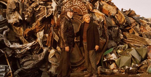
Billed as a satire of the world arms trade, Micmacs stars Dany Boon as Bazil, a man who loses his job and apartment when he spends a lengthy stay in a hospital after being shot in the head. That we see his father killed by a landmine in the opening scene and it doesn't take long to realise he has some bad luck. However, he soon ends up in the company of an underground team of social outcasts who live in a cave made from scrap metal and appliances. It's not too long before the group, which includes Jeunet regulars such as Dominique Pinon and Yolande Moreau, come together to help Bazil reap his madcap revenge upon the landmine manufacturers responsible for his father's death and the ammunition corporation responsible for the bullet lodged in his head.

What follows is an increasingly elaborate, excitingly eccentric and hilariously entertaining series of events as this group of misfits band together on one nasty, yet startlingly original, trick after another. There's really no way to truly explain how giddy Micmacs made me with its sheer imagination. Filled to the brim with typical Jeunet novelties like Aline Bonetto's wacky art direction - long gone is Jeunet's former collaborator Marc Caro, but his influence remains - the kooky cinematography by Tetsuo Nagata as well as any number of singular quirks. How about the appearance of billboards throughout Micmacs advertising the very movie that we are watching? How about the alien-like sign language that character seem fluent in. The black and white film credits featuring music by Max Steiner or a scene involving an orchestra that would feel cynical in the arms of another director.


Comedies in a foreign language can be tricky for audiences since so much of what one nationality may find uproarious can be anything but to another. Micmacs successfully avoids this trap and proves to be a winning bout of absurdist fun. It's a true joy to watch the imagination found within the screenplay by Jeunet and Guillaume Laurant unfold. While I am sure that Jeunet's detractors will continue to be bitten by the grouch bug, there's no reason for everyone else to not go out and revel in the fun that is to be had. Micmacs is a treat! A-

Wednesday, March 31, 2010

Jeremy Saunders - The Poster Man

I had the pleasure of doing an interview with one Jeremy Saunders. In the same five years I have increasingly become addicted to poster artwork, as I'm sure many of you have noticed, and Jeremy Saunders was the first name in the field whose name I knew. His early designs were always good, but it took a while for the man to truly be recognised as the key art extraordinaire that he is. You would have seen a bunch of his designs littered about in my top 50 posters of the decade list from earlier in the year as well as the (outdated, yes, I'd totally change so much about that list now) 100 greatest movie poster list I did back in 2008.

The interview is now up at Trespass Mag and it would be nice of y'all to read it. He gave me a wealth of stuff to write about, which is always good.

Image courtesy of Mark Rogers.

Thursday, March 25, 2010

Review: Welcome

Welcome
Dir. Philippe Lioret
Year: 2010
Aus Rating: M
Running Time: 100mins

The surprising, and quite shocking, laws that revolve around the French illegal immigrant crisis provide the central crux of Philippe Lioret's Lumiere Award-winning drama Welcome. With its ironic title, strong performances and its tale that plays like a harsher and all-around better version of The Blind Side, Welcome becomes one of the most refreshing French titles to reach Australian cinemas in a while, if not necessarily one of the very best.

It's a fantastic and gripping opening sequence where we witness Kurdish teenager Bilal (newcomer Firat Ayverdi) attempting to make his way out of France to get to his girlfriend in England. Along with his travelling companions, Bilal is captured and thus sets of a chain of events that will see him cross paths with former Olympian Simon (an excellent Vincent Lindon) who now gives swimming lessons at a local public pool. Simon's ex-wife, Marion (Audrey Dana) warns the gruff and lonely Simon that helping this boy could result in five-years jail and a substantial fine, something that I was personally quite shocked to discover were actual repercussions for anybody found guilty of helping these refugees in France under Nicolas Sarkozy's government.


It's a stunning facet of French society that lends Welcome a substantial amount of heft in the drama stakes. Helped along by a screenplay by Lioret, Emmanuel Courcol and Olivier Adam that thankfully steers the rather Hollywood storyline from the mundane to the potent. I couldn't help but see the similarities between Welcome and The Blind Side as both revolve around people who are thoroughly bored with their lives and decide to help someone far less fortunate than they, despite the social implications, and all-but adopting their chosen cause. Welcome is obviously the better film and thanks to Lioret's direction, it manages to be warm without whitewashing.


Unfortunately it is this Hollywood arc that allows the film to slip when it shouldn't. Characters other than Simon are rudimentary and black or white, whether it be the saintly ex wife school teacher who feeds the homeless in her spare time, the evil neighbour who glowers and represents the conservative right, or the naive Bilal. I found it quite difficult as a viewer to truly believe Bilal's mission - to swim the English Channel - or that he was stupid enough to attempt it. So much so that the film's end lacked the emotional punch that I suspect others felt. The film's strengths do not lie in its subtleties, but more in the performances, the light that it sheds on such a troubling development for French politics and Lioret's ability to keep the audience fixed on this important issue. It's just a shame that the end turns far-fetched. B

Sunday, March 21, 2010

Review: The Secret of Kells

The Secret of Kells
Dir. Tomm Moore
Year: 2009
Aus Rating: PG
Running Time: 75mins

I'm going to fess up right from the get go: I haven't the foggiest idea what The Secret of Kells is going on about. Minimal research has told me about the Book of Kells, but that still doesn't help me. Throw in the movies' enchanted forests, mystical foreign lands and weird ghost girls who turn into wolves and I basically sat down for 75 minutes without the faintest idea as to what I was watching. Thankfully what I was watching was pretty, so it has that going for it.

The Secret of Kells is an Irish hand-drawn animated film that surprised with a nomination at the recent Academy Awards in the Best Animated Feature category. The film isn't anything particularly exciting - if ancient religious books and Irish lore circa the ninth century is your idea of exciting then by all means, be excited - and manages to be as successful as it is because of its, at times, rapturous animation beauty. So many gorgeous sights to behold within this movie despite the rather simple design of the characters. I particularly found myself in awe of a moment involving a pit of butterflies. At times even flirting with a sort of art deco design, The Secret of Kells wouldn't have been my pick for a token arty nomination, but I can't say that the branch weren't thinking for themselves when they jotted it down on their ballot. B-

Tuesday, March 16, 2010

Review: Brothers

Brothers
Dir. Jim Sheridan
Year: 2009
Aus Rating: M
Running Time: 104mins

As my friend and I walked out of our screening of Brothers we couldn't help but both point a finger on what we felt was wrong with it. Not that either of us didn't like it, much to the contrary actually since we both liked it quite a bit, but it was the ending that left us unsatisfied. Now, I am not a fan of writing reviews in which I express my obvious* wisdom** and let the director know what they should have done, but so strong was our argument that I can't help but bring it up. More on that later.

I have not seen the Danish film by Susanne Bier, Brødre, that Jim Sheridan's film is a remake of - although it was immediately placed atop my DVD queue when I got home - but I am lead to believe that he and screenwriter David Benioff have been incredibly faithful. I imagine many people will be in a similar situation and will be going to see Brothers based on the accumulative star power of Tobey Maguire, Natalie Portman and Jake Gyllenhaal rather than their fondness for the original so I don't think that harms one's critical assessment of the film.


Having been sent away for another tour of Iraq, Tobey Maguire's Tommy Cahill is shot down and presumed dead, leaving a grieving wife (Natalie Portman) and recently-released-from-jail brother (Jake Gyllenhaal). Anyone who has seen the original film will know what follows and those who have not will surely be able to guess, but may be surprised at the extent. Once Tommy returns home - this is not a spoiler since Maguire is the first credited cast member and it is all over the marketing - he sets in motion a series of romantic and familial troubles.

While Portman is incredibly miscast - surely she is the hottest young mother of two in a Hollywood movie - the rest of the cast is the main reason you should see the film. Maguire received the bulk of the praise, even receiving a Golden Globe nomination, and he is fine even when Tommy descends into madness, I thought it was Gyllenhaal who came out best out of the three major players. Even then, the best work is left to the supporting players. Mare Winningham is truly wonderful as Maguire and Gyllenhaal's stepmother, while Sam Shepard has some fine moments as their father. A dinner scene late in the movie allows Bailee Madison to shine as the eldest, angry Cahill daughter and in a tiny role is Jenny Wade who makes quite an impression with her limited screen time.


The film generally works quite well and manages to spin a considerable about of drama out of the quite formulaic storyline. However - and I did warn you this was coming - I think Sheridan and Benioff did a disservice to the film by revealing the secret behind Maguire's character and what happened to him in Iraq. The film makes no secret of what goes on and I can't help but think that the film would have packed a more substantial punch if they had have left it a secret and allowed it to be revealed to the audience at the same time as it is revealed to the characters in the movie. As it is the film ends of a relatively flat note. It builds and builds, but then just ends because Maguire's big confession is little more than telling us something we already know, making it land with a dramatic thud. B

Now I need to see Brødre

* Ahem
** AHEM!

Monday, March 1, 2010

Review: The Blind Side

The Blind Side
Dir. John Lee Hancock
Year: 2009
Aus Rating: PG
Running Time: 128mins

It’s not too often that a Sandra Bullock movie causes such debate amongst film-lovers. I am a fan of Ms Bullock and think her performances in fare such as Speed and While You Were Sleeping proved far better than the genres of action blockbuster and rom-com usually warrant. Four years ago she gave a stirring performance in racial-themed Oscar-winner Crash, and now she’s back in the wheelhouse, receiving an Oscar nomination herself for her role as a woman who adopts a homeless African-American teenager.

You can read the rest by clicking over to Trespass Mag.

As I say in the comments, this was a tricky movie to review. As a movie it's not that great - nor is it particularly bad, either, it's just there - but it is not a movie that was made for hardened film lovers. It is a movie made for mass audiences that isn't asking for much more than to have a big grin on their face as they leave the cinema without feeling as if they need to understand that the wheel has been revolutionised, and in that regard I think it succeeds.


Personally, I am quite proud of my line about how The Blind Side is like Slumdog Millionaire, but with polite suburbanites who own beige sweater sets from Target. What are you thoughts? click over and let us know.

Thursday, February 25, 2010

Review: A Single Man

A Single Man
Dir. Tom Ford
Year: 2009
Aus Rating: M
Running Time: 101mins

The debut film from fashion designer Tom Ford is the cinematic equivalent of an actress with excessive plastic surgery. A Single Man may look perfect, but scratching the surface just a little and I found that the film’s style is the result of too much preening, polishing and enhancing. Ford’s film is an addict for prettiness and in the process resembles an excessively over-designed photo shoot rather than a film.

You can read the rest by clicking over to Trespass Mag and let me know what you think? Were the film's technical aspects a help or a hindrance?


I didn't get to mention it in the review - or, I did, but I had to cut it out due to word limits - but in the part about how overly designed the film is, I made a query regarding the production design. That house that Colin Firth's George lives in is gorgeous, yes, but was anybody else confused by the fact that this gay man in the 1960s lived with his boyfriend in a house made entirely out of glass? Architecturally it was stunning, but a man who so obviously tries to keep his sexuality a secret, I couldn't think of anything sillier than living in a house where anyone could see inside. That just struck me as... off. C (although Firth's performance could probably bump it up to a C+ if I'm feeling generous.)

Wednesday, February 10, 2010

Review: The Wolfman

The Wolfman
Dir. Joe Johnston
Year: 2010
Aus Rating: MA15+
Running Time: 125mins

Who would have thought that only six weeks into 2010 we would have a contender for worst film of the year? Actually, after only six weeks into the new decade! Alas, that is what we have in The Wolfman, directed by Joe Johnston - a severely misjudged and poorly executed monster movie.

Read the rest over at Trespass Mag for which this is my first piece. Hopefully more to come!


I did want to mention some other stuff though. Word limits can be a blessing or a hindrance and in this case it was the latter. So many awful, awful things to talk about. How about how the sets and the costumes, as pretty as they are, are entirely washed out by the horrible cinematography that makes everything look dank and dark as if they were shooting with only natural light and the only natural light they had was a cigarette lighter. I was so surprised when I saw all of these movie stills since they certainly did not look like in the film.

Or how about the bombastic sound design? It wouldn't have been that bad if The Wolfman wasn't one of those movies that utilises the "boo machine" literally every few minutes. By ten minutes in I had already smartened up to their game. Seriously you guys, the failings of this movie should be written into cinematic lore for all to gawk at for decades to come. F

Monday, February 1, 2010

Retro Review: Epsilon

Epsilon
Dir. Rolf de Heer
Year: 1997
Aus Rating: PG
Running Time: 92mins (US) / 102mins (Aus)

Rolf de Heer's Epsilon is a curious film. Released in 1997 - released under the name Alien Visitor is other territories with a poster of a shapely woman with sexy hips and a narrow waist - and starring Syd Brisbane (as "The Man") and Ullie Birve ("She"), it tells the story of a, you guessed it, alien visitor from the star Epsilon to Earth. Accidentally sent here, but since she's here she's going to spell out The Message of her people to The Man. Her Message? Well, think of all that stuff Al Gore spoke about in An Inconvenient Truth and you'll get the idea.

Yes, us Earthlings are killing the planet and raping it of its natural beauty. I can only imagine what certain audiences - those that were so shocked by Truth's tales of horror that they stopped leaving the tap running when brushing their teeth (how noble of them), more specifically - would have thought of it at the time. If anyone did actually go and see it at the time, I mean, which I can't seem to find any actual evidence of other than a nomination, much deserved, for Best Cinematography from the AFI.


This aspect of the film is all hopelessly hammer-headed and as subtle as a bullet to the head, but Rolf de Heer's strengths are not in subtlety (just watch Alexandra's Project or Bad Boy Bubby for further examples). Where the film does work is in the relationship between The Man and She that develops as these two experience each others worlds of distress (his personal, hers planetary). Whether it be romantic or pure respect, there are moments of pureness and, at times, a gentle playfulness that is sweet. The technical work from Rolf de Heer regulars (before and after) such as Tony Clark (cinematography, taking its cue from the work of Ron Fricke with gorgeous time lapse nature photography throughout), Graham Tardif (score) and Tanie Nehme (editing) make the film hypnotic to watch at times. It's just a shame the heavy-handed M-E-S-S-A-G-E was played in such a ridiculous way. C+


Quite hilariously on the recently-released DVD - from the Rolf de Heer Collection, a wonderful box set that also includes, amongst others, Bad Boy Bubby, The Quiet Room, and my personal favourite, Dingo - there are two versions of Epsilon. The original cut and the "Miramax Cut". The "Miramax Cut" is exactly why so many people hate Harvey Weinstein. Included in it is a grandmother telling her grandchildren around an outback campfire about the story of a woman that came to Earth to teach a now-famous environmentalist about the world's ills. Her narration punctuates the film whereas it is nowhere in sight in the original cut and was merely put there so American audiences had a clue as to what was going on (because it was so hard to follow otherwise). Neither version is better or worse, however, so it's all a bit of a moot point in the end.

Thursday, January 28, 2010

Review: The Room

The Room
Dir. Tommy Wiseau
Year: 2003
Aus Rating: M
Running Time: 99mins

Yesterday I had what I think I can say was the greatest cinematic experience of my life. Granted, I’ve only been alive for a quarter of a century and have made the cinema my second home for only half of that time, but last night was without a doubt a truly mind-blowing experience that I will not forget any time soon. I don’t think it’s making too much of a leap to say that Tommy Wiseau’s The Room is anything short of one of the very worst movies ever made in the history of cinema, but I’ll be damned if it doesn’t make for one hell of a cinema going treat.

The Room follows the love triangle between three people who are also best friends and all live in the same apartment complex. It’s like Friends, but without the pretty hair and the sarcastic comebacks and “Smelly Cat”. Not to put too fine a point on it, but The Room is trash. Garbage, pure and simple. Horrendously written, acted even worse, shamelessly narcissistic and flat out ugly, and yet it is these very qualities that makes paying for a ticket and witnessing it all the more entertaining.


Last night I did indeed have the pleasure of attending a special advance preview screening – seven years after its release in the US I should add, which says a lot – of The Room before it begins an exclusive limited late-night run on Saturday nights throughout February at the Cinema Nova in Carlton. We had the added extra of having a Tommy Wiseau fan club in the audience, which certainly helped the crowd relax enough to openly mock this disastrous movie. I can’t speak for everyone, but the majority of the audience was certainly getting into the spirit of the event and only the dullest fuddy-duddy could sit there without laughing at the events transpiring on screen.

All part of the “event” of seeing The Room on the big screen was there. Partaking in cult rituals such as throwing spoons at the screen whenever a piece of spoon-related artwork appears, yelling “CANCER!” whenever the cancer-stricken (yet only once mentioned and in a hilarious nonchalant manner) mother appears on screen, chanting during panning shots of the Golden Gate Bridge and cheering when it reaches the other end (or expressing vocal disappointment when it does not), openly expressing one’s outright disgust at the many sex scenes, openly pointing out continuity flaws (a character is played by two completely different actors), bizarre lapses in logic (the engaged lead character never say the word “fiancé”, only “future wife” or “future husband”!?), strange nonsequitors (the aforementioned cancer, or the drug debt that the mildly-retarded Denny character finds himself in) or just howling with laughter at the sheer badness of the movie’s structure, special effects and original songs.


By the end of the 100 minutes that The Room somehow takes to tell its ridiculous story my voice was hoarse, tears had formed in my eyes many times and I had run out of plastic spoons less than half of the way through. John "Outland Institute" Richard and I had a riot. Openly bantering between one another, normally scornful, but here it just adds to the experience. Wanting to hear what other people are saying is part of the fun, realising that you noticed the same strange quirk as others - what was with all those GIANT candles?

The Room is not a movie you can sit down and watch by yourself on DVD. If you don't have the chance to witness it in all of its glory on a cinema screen then gather some friends, pop open a few (or ten) beers and let the experience be had. I can only hope that someday I get to watch movies like Showgirls or Jack Frost on the big screen with an equally appreciative audience. Nothing can quite replicate the experience of The Room, it's truly one-of-a-kind. As a film? F! As a cinema-going experience? A+

I would just like to add that The Room is a perfect example of my argument that you can't create a cult movie. A cult movie needs to be organic and grow out of a filmmaker legitimately thinking they are making a good movie. The Room didn't start out as a cinematic punching bag, but that's how it ended up. However, I can guarantee that there was even the slightest hint of Wiseau or his cast being in on the joke that it wouldn't be funny.

Friday, January 15, 2010

Top 50 Posters of the Decade: #25-1

Read Part One of the countdown from yesterday, if you didn't see it, before we continue on today with the best posters of the decade.

25. Zoo

Something about such a clean line makes this quite cold-design stand out (notice how it sorta looks like a back-to-front Z?) The detail looks so real and that tagline is excellent.

24. Irreversible

If you have a film that is a hard sell and has a scene that is sure to infamous then my general rule would be to utilise said scene in the marketing and that's what they've done here. The image is disturbing and frightening and the font play is another way the audience can become discombobulated. Gives me the creeps.

23. Mulholland Drive

It just feels so grand and old-fashioned (although I'm not sure why). Perhaps I am just biased towards the film - although this is the only poster that I am really keen on, for what it's worth - but the image has a mysterious quality that I've never been able to shake.

22. Black Snake Moan

Samuel L Jackson tying Christina Ricci up in chains on a retro grindhouse style of poster? Sign me up! Perhaps that's why the film flopped, because the marketing was so spot on. You can't say they chickened out!

21. American Psycho

Hot Jesus on a Sunday afternoon I think we could all afford to see that poster hanging in cinema foyers and on Blockbuster shelves couldn't we? COULDN'T WE?!? Why should women be the only ones objectified on movie posters? WHY?!

20. Small Time Crooks

The first of two Woody Allen posters to show up in the countdown. Fun visual gag alongside that attention-grabbing silhouette and a silly, but delightful, tagline. Considering the efforts that have gone into some Woody Allen films this past decade (go have a look at the horrendous designs for Whatever Works, Scoop and Anything Else) I think we can safely call this one a winner.

19. Michael Clayton

OMG! He's disappearing before our very eyes!!! You get the idea.

18. Precious

This (literally) shattering design that floored me the most of the film's many various designs. And for a movie poster to so bluntly push the film's sexual abuse angle is quite shocking.

17. Synecdoche, New York

It's not the most clean and well-executed poster on the list, but I love the idea and the almost home-made look of this Asian poster for Andy Kaufman's workout for the mind. It's a collage and I do love a collage!

16. Miami Vice

As part of a three-piece series this one-sheet featuring Gong Li bathed in shadow and sex stood out. Delicious blue colour and mystery out of the wazoo makes this poster just ooze Miami fever.

15. The Girlfriend Experience

"SEE IT WITH SOMEONE YOU ****" + Polka Dots + Barcode + That Face = #15 on this countdown. What a concept!

14. Goliath

The ultra-indie mumblecore movement brought us some unique and wonderful designs this decade from outside of the system and I have no idea what the movie is and yet I feel like I must see it or else I will EXPLODE. A lot of the time posters for these low budget independent movies can be really bad, but sometimes they have the luck of hiring a great designer (not necessarily a great design studio) who can come up with something like this.

13. Dear Zachery: A Letter to a Son About His Father

Quite moving, isn't it?

12. Anything Else

When I said up above at #20 that Woody Allen's Anything Else had been saddled with a dreadful poster I did not mean this - yet again - Asian design. What a treat this one is! Overflowing with visual delighs, from the use of that old-style map of New York City to the funny drawing and the apple and it all just adds up to something wonderful and almost whimsical (but not in the annoying indie way).

11. Bug

This poster freaks me the fuck out!!

10. Hard Candy

A masterpiece of imagery. Oh to be in the room when this idea came up, huh? I think everyone's heads must've exploded.

9. House of Wax

Horror one sheets need extra care and attention, they really do. They need something to stand out. And on that, this design for House of Wax does it's job perfectly, selling the premise (they turn people into wax statues) and doing so in a creepy and effective manner.

8. American Gangster

The posters for American Gangster are the reason why I spend so much time discussing the bad posters. This film is incredibly mainstream with a couple of big stars and an easy-to-sell premise, just like many movies. Except unlike those other movies the makers of this one chose to actually do something altogether different instead of throwing a couple of giant floating heads hovering over a pile of guns and cocaine like you would normally expect.

7. Look at Me

Another Jeremy Saunders design. I love the imagination on display here and for a movie that plays very literal (it very much relies on its words as spoken by intelligent people) it's a very sly design.

6. The Centre of the World

Sex. Lollipop. Hooker Heels. Red. Red. Red.

5. Anacondas: The Hunt for the Blood Orchid

I haven't seen this movie, but I can't imagine it being anything other than ridiculous C-grade shlocky horror. Thankfully for us poster work doesn't discriminate and shlock horror tends to produce some of the most interesting designs. That is very much the case with Anacondas. This poster makes me wish that it had been around during the times of VHS and it would have used that bubble design and I probably would have spend time at the video store just ogling it.

4. INLAND EMPIRE

There are but two things you need to sell when it comes to INLAND EMPIRE. Those are David Lynch and Laura Dern. That they used Laura Dern's FAAACCE moment is what makes this design work so wholly. It is truly one of the scariest posters I have ever seen and yet I still want to hang it on my wall.

3. Antichrist

More Jeremy Saunders. I told you he was a genius at this stuff. So much has already been said this past year about this poster - hell, I've already done a blog piece on it earlier today - so I won't go into it again, but just look at it and tell me it doesn't make you queasy, excited, frightened, intrigued and perhaps even a bit giggly.

2. Suburban Mayhem

It's brilliant and I love it and it's amazing and perfect and stunning and just seriously great. From the comic book style, to the colour, to that amazing Emily Barclay pose to just everything.

And so we come to the top of the list. When I decided to do this list I already had the #1 spot locked and loaded. I didn't need a second opinion or to think it over, nothing. I knew. And I'm pretty sure you knew too!

1. Funny Games US

A poster that, itself, plays games with the audience. Is it a movie still? Is it painted? Is it just photoshopped? Who knows. I don't and I don't care, because it just looks so incredible. It would have been so easy to make this one of those annoying stripey posters or one where Naomi's tear-stricken face adorns the bottom right hand corner surrounded by empty space, but it's not. They chose to use an image that not only strikes possible pain, anguish and terror into anyone looking at it, but does so in a manner than screams "WE'RE HERE!" There's no hiding from Naomi's face on this one.

The contrast, that image, that tagline, the simple helvetica font, it all just works. It's become iconic in poster-watching circles and for good reason. It's topped most similar lists to this and, for a change, group think is actually right! Viva la Haneke, I guess. Nothing can get me to actually watch the movie (so perhaps that's an immediate fail right there?) but this poster should be plastered all over my wall like wallpaper and like the Mona Lisa it would follow me everywhere.

And that's that folks. Hope you enjoyed and hope you got plenty of eye candy out of it. Feel free to discuss in the comments. Agree? Disagree? Do you think I missed anything (I didn't)? Dive in if you wish. It's been a blast.