Thursday, January 8, 2009

Review: Frozen River

Frozen River
Dir. Courtney Hunt
Year: 2008
Aus Rating: MA15+
Running Time: 97mins

It's a shame that Courtney Hunt's Frozen River is so good. It's unfortunate because now I will most likely be incredibly disappointed when this debut director falls between the cracks of the lead performance she helped create. Much like Kimberley Pierce, who took nine years to return after Boys Don't Cry, and Patty Jenkins, who has yet to direct another motion picture after Monster in 2003, Hunt's film is primarily getting attention for it's lead performance.

These three films do indeed have more in common with each than a mere powerful central female performance. Most importantly, all three have such an incredible sense of place, all revolving around the ubiquitous themes of woe in Small Town, USA. Whether it be the murky grotesqueness in the late 1980s of Monster (one of my very favourite films of that year), the endless horizons of the bigoted country town of Boys Don't Cry or the snow-covered regions of Frozen River, each of the films makes the landscape a vital part of the film. Without it there is no real understanding of the films or their characters. Hunt's opening shots are of iced-over rivers, muddy stretches of road and lands casually dotted with trailers all covered by gray clouds and it immediately sets a tone. One rich with texture and intrigue.


In the northern border region of New York state we meet Ray Eddy (Melissa Leo) whose husband has skipped town with the money they were to use to purchase their new double-wide home. Scant of cash and in need of more than the part time wage the shopping mart provides her with she begins to ferry illegal immigrants over the border after an encounter with a young Mohawk woman (Misty Upham). Sounds bleak, but it's done in a similar way to the aforementioned films that really works. The final act effectively works as a thriller, but not in the traditional sense of the word and it ends in a way you wouldn't expect even if you see the general idea coming from the opening scenes (I did, so I imagine many others will too).

As for Melissa Leo, who has certainly been keeping herself busy lately, will surely have "broken out" after this and it's hard not to see why. While not as violently explosive as Charlize Theron or brutally moving as Hilary Swank, she feels equally as evocative as the desperate but not dispirited Ray. Upham is affecting in moments and Charlie McDermott is impressive as Leo's teenage son. I, too, thought the treatment of the Native American storyline was well-done. It was fascinating to me as somebody who knows almost nothing about this culture to see it so thoroughly portrayed with what I assume was respect and it's yet another vital contributor to the film's success.


Frozen River isn't as downbeat and depressing as it may appear, honestly. I'd hazard a guess and say this film isn't anywhere near as grim as others may like to paint it as, actually, thanks to Hunt's intuitiveness. It is a tough watch at times, sure, but it is also so powerfully acted and skillfully made - Reed Morano's cinematography and the minimal score by Peter Golum and Shahzad Ismaily need special mention - that you forget about all that and instead focus of the impeccably made film beneath. Frozen River is a very strong film and one that felt like a breath of fresh air in a year that has felt distinctively unimpressive and been-there-seen-that. A great story tell-told, is what I say. A-

Saturday, December 27, 2008

The Best (and Worst) Posters of 2008

It is frustrating sometimes being a movie lover and not living in New York City (oh to dream). I am routinely unable to do a top ten list until June! Luckily for your guys I don't have to have seen all the movies to be able to judge their key art. As anybody who has read Stale Popcorn for longer than a week will know, I love posters. I talk about them a lot. This past year I even did a top 100 countdown and so here on the even of 2009 I present my favourite (and least favourite) pieces of poster art for the year 2008. I'm sure I've missed something that I will regret leaving out (such as the Zoo poster from last year's countdown), but thems the breaks!


(All posters can clicked on to enlarge)
(All posters accumulated at IMP)

THE TEN BEST POSTERS OF 2008
10. Wall-E

Retro animation at it's finest.

9. The Strangers

Okay, so it spoils the film's biggest and best scare - although, so does the best trailer of 2008, side note - but it does everything a poster should: Makes you want to see the movie. If the thought behind this poster's image doesn't get you then you were never going to see it anyway.

8. In Bruges

I love a poster that is playful like this. See also The Bank Job.

7. The Black Waters of Echo's Pond

For all the huss-and-fuss over the poster campaign for last year's Grindhouse, these two posters for an obscure horror flick are the two most retro designs that I have seen recently. From the tea-stained borders, the creases and the hand-drawn aesthetic. All so wonderful.

6. The Wackness

You know you're on the right track with a movie set in the early 1990s when your key art instantly brings back memories of recording mix tapes. Such pitch perfect design here.

5. The House Bunny

No poster made me laugh as much as this poster, which puts Anna Faris front and centre where she belongs.

4. The Dark Knight

I couldn't decide which of these I liked more. The more classically beautiful city shot or the twisted and crazier Joker design. I cheated and used both. They're both excellent.

3. Goliath

I knew I had to rank this poster high because I have no idea what the movie is and yet I feel like I must see it or else I will EXPLODE. A lot of the time posters for these low budget independent movies can be really bad, but sometimes they have the luck of hiring a great designer who can come up with something like this. Another of these nearly made it in for the movie Fix, but it fell just short of the top ten.

2. Dear Zachery: A Letter to a Son About His Father

Just absolutely beautiful. Stunningly so.

1. Funny Games

Was there ever any doubt. Truly a masterpiece.

Now Just For Fun...
(excluding previously mentioned posters)

Best Rip-Off:
The Spirit

For ripping off everything about Sin City.

Best Poster That Could Have Easily Been Terrible:
27 Dresses

Essentially for not being this or this or (heaven forbid) this.

Dreamiest Use of Colour:
Slumdog Millionaire


Best Poster Series:
(Excluding The Dark Knight and Wall-E to be fair!)
No Right Turn

I know they're all fairly simple, but I like these posters, don't you?

Best Saul Bass Impersonation:
Burn After Reading

Runner-Up: Flawless - it would've won if it completely gave in to the idea.

Sexiest Poster:
Elegy

Might as well sell your movie on Penelope Cruz' posterior, no?

Best "Do They Realise?" Moment:
Paranoid Park


Worst Photoshopping:
Sex and the City: The Movie

Or, since the scene is actually in the movie, Worst Non-Photoshopping When Photoshopping Was Necessary?

Unscariest Poster for a Scary Movie:
Dying Breed

Runner-Up: One Missed Call

Worst Backtracking:
August

Ummm... they went from a poster that told you enough to one that doesn't tell you a thing other than "Josh Hartnett wears clothes in this movie" and who wants that, honestly?

Worst False Advertising:
Sex and Death 101

Bridget Fonda circa the early '90s is not in this movie!

Worst "Empty Space" Offender:
Revolutionary Road


Most Unappealing Poster:
How to Lose Friends and Alienate People

Ugh, why would I want to see this smug-looking piece of garbage?

The "This Deserves a Better Poster" Award:
WHERE DO WE START?!?
Milk, Revolutionary Road, The Curious Case of Benjamin Button, Rachel Getting Married, Changeling... etc etc. What a terrible terrible year for Oscar movies and their posters. Literally all of the above were dreadful!


~~-~-~~

The First Annual Showgirls Honourary Award for Brilliance in the Face of Ineptitude in Poster Design:
Whore

~~-~-~~

And that's that, folks. I can't be bothered doing any more because I'll go blind. What did you think? Did I miss anything? Speak up in the comments, please!

Friday, November 14, 2008

Black + White Friday: Moulin Rouge!

Sorry for the lateness, but as I originally wrote, yesterday was a very long day and so here I am doing this now. Voila!


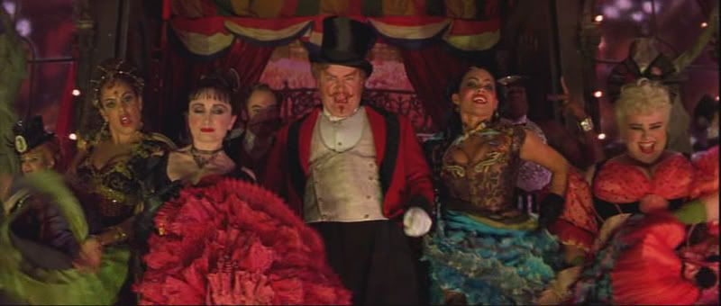
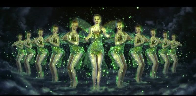
It's is probably not at all surprisingly to learn that I spend a lot of my day thinking about Baz Luhrmann's Australia and then yesterday I had a hankering to rewatch (for the millionth time) Moulin Rouge!, the film that gave birth to what will likely be an entire lifetime of devotion to the man and anticipation of every single project he will ever embark on. However, upon rewatching it last night, I decided to take a different tact with Moulin Rouge! in this "Black+White Friday" series. Most of the other movies I have screencapped for you guys have had me trying to turn the original into something else, something classical that I think the originally was going for (see, for example, The Others and The Texas Chain Saw Massacre), but while it would be easy to do this for any musical and say "let's see what it would look like if it were made in the heyday of the Astaire and Rogers!" it is impossible to do that with Moulin Rouge! It could never have been made in any other time, by any other person or in any other way, which is why it's such a case of bravura filmmaking.

So, instead, I merely found a bunch of moments that I thought would look nice in black and white - there are plenty - because to try and drain this or this of colour is both silly and a crime against humanity/cinema/life/etc, don't you think?


Upskirt shot! How rude. But seriously, what an incredibly shot.


Proof positive that Nicole Kidman would've been a star in any generation. Not every actor can look so classic in both colour and black and white, but she does it. But, then again, we already knew this, didn't we?


This shot has always made me chuckle. Something about it makes me think it should be in a horror movie about a brood of bald men who come together on Halloween to steal the souls of children (or something to that effect).


One of the (many) film posters I have saved onto my computer is one for the 1954 film The Barefoot Contessa (here is an alternate version of the one I have, I can't remember where I found it unfortunately) and it wasn't until I took this grab that I realised how similar the two shots are. Hmmm.


This moment reminds me of Guy Maddin's Dracula: Pages from a Virgin's Diary. Strange, but true.


Oh Kerry Walker, bless you. And as an aside, I actually think this scene is Kidman's best in the entire movie and perhaps one of the purest in the film. A lot of people think the musical scenes only work in this movie because of the production Luhrmann puts behind it, but this tiny moment shows there's true power in it and that Kidman actually does have a good voice. I am indeed quite interested to see how she handles her next musical, Nine.


"The Show Must Go On" is routinely one of my favourite unappreciated moments from the film and I remain adamant that it is Kidman's strongest moment vocally. I do have a random question for all you Oscar-philes out there. How long was it between nominations for a musical performance? Surely Kidman's Best Actress nod in 2002 was the first for quite some time, right? Anybody know? I could try and research it myself but, ugh, effort!


How cool and retro-horror is this shot? Answer: Very.


Funny story: I once received an e-mail from somebody claiming to be Lionel Haft (who plays The Duke's manservant "Warner") - and who would fake that, honestly? - who was angry at me for ripping apart his performance in the terrible schlocky Aussie crapfest Solo. I mean, it doesn't top receiving an e-mail from Rena Riffel (another true story), but it still amuses me.


Similar much